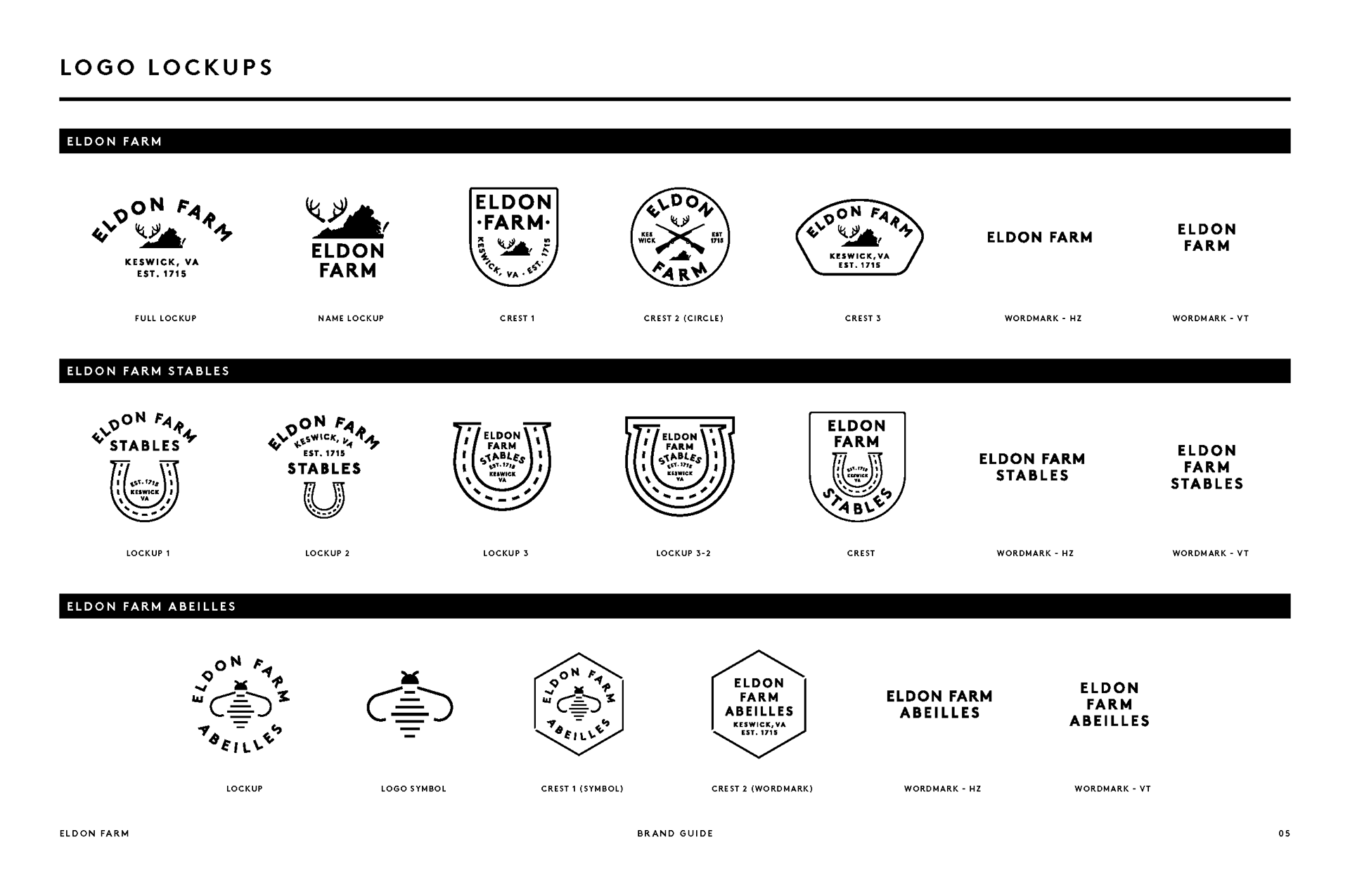
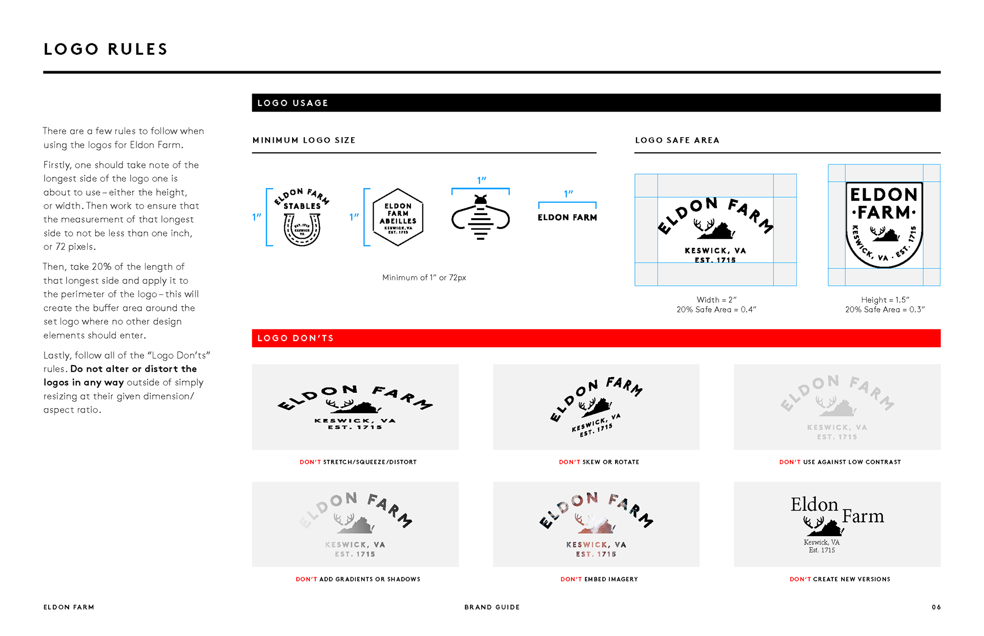
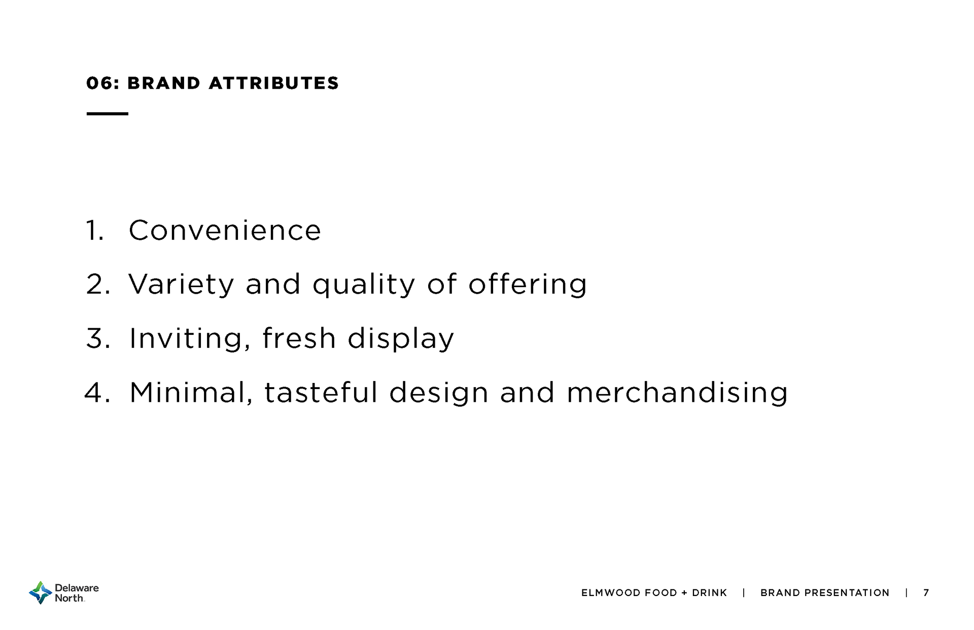
A strong brand isn’t just a logo — primary marks, secondary marks, typography, icon sets, and even illustrations help a brand flex, adapt, and stay recognizable across different touch-points.
I design brand systems that keep things cohesive and charismatic.

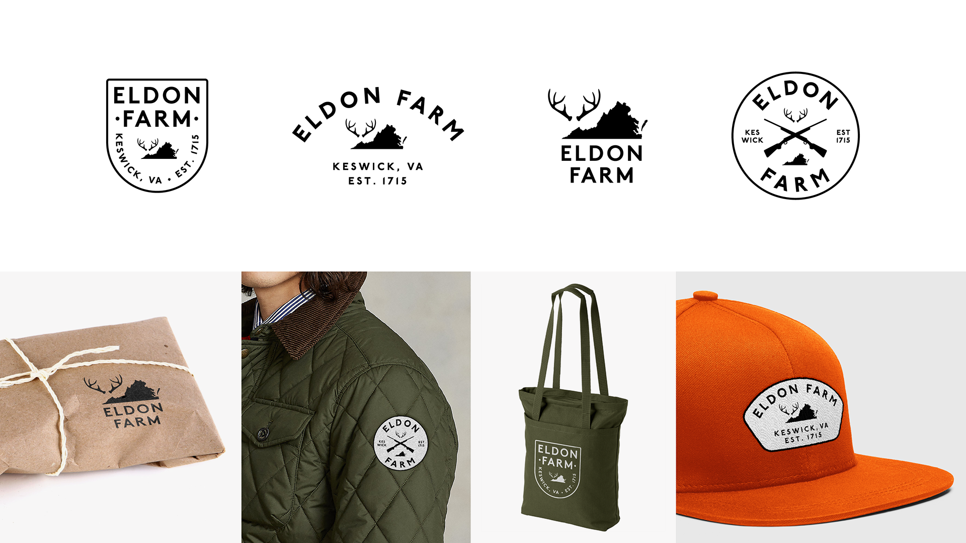
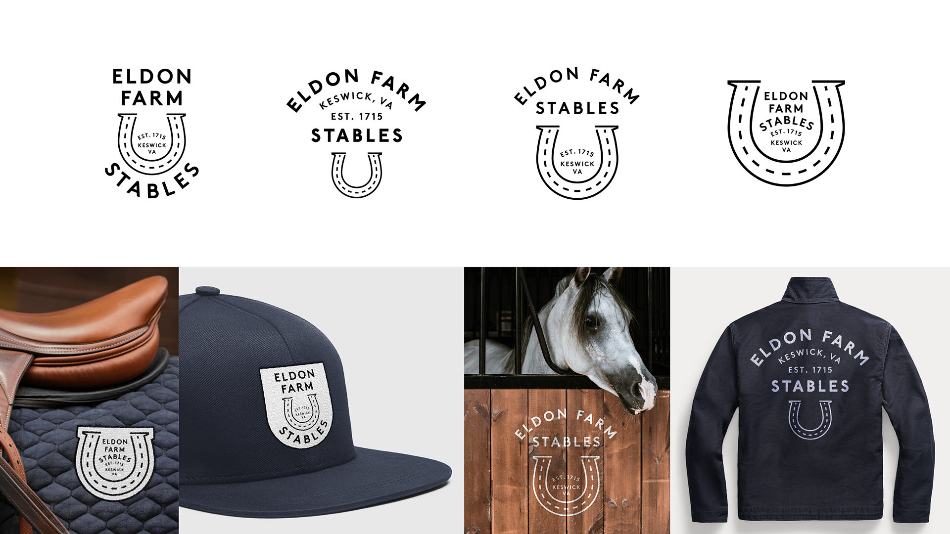
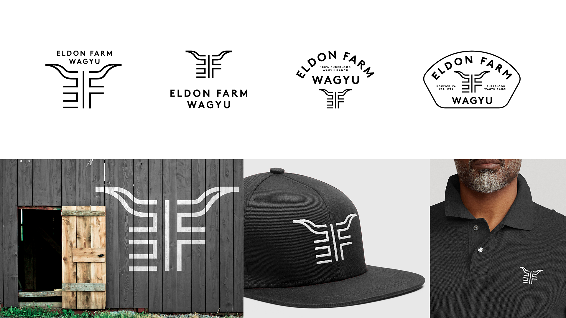
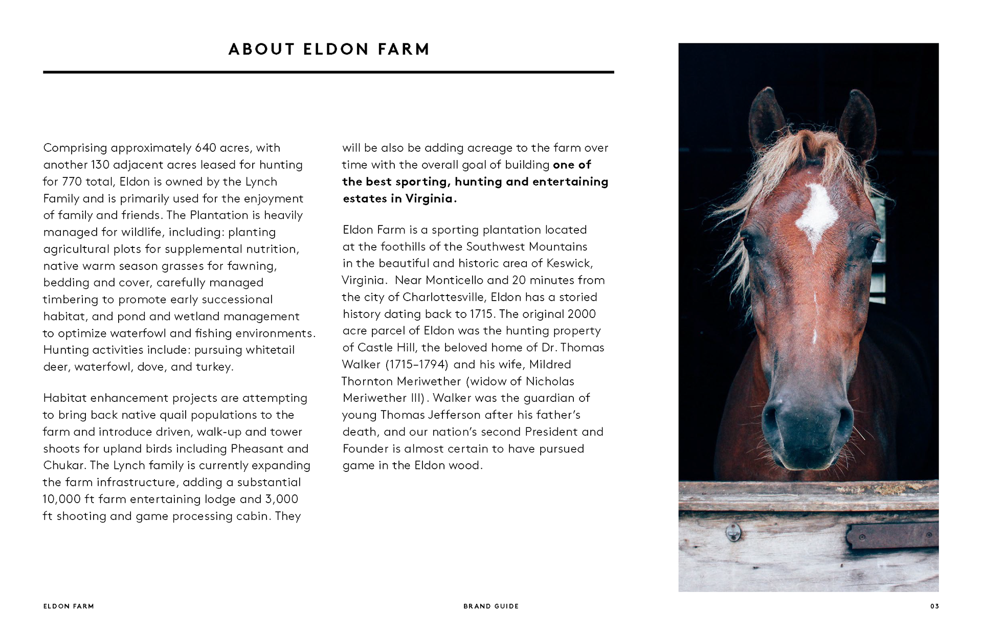
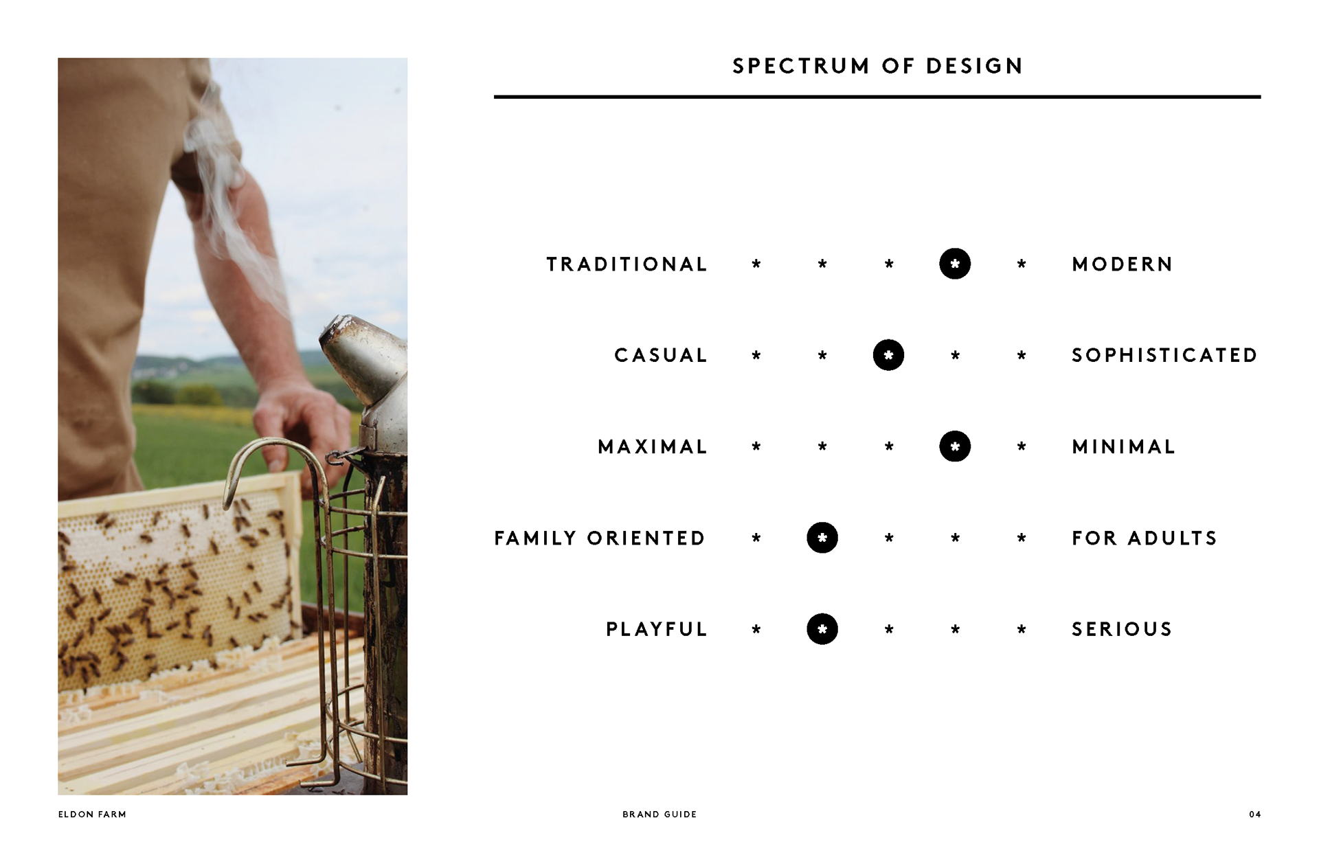
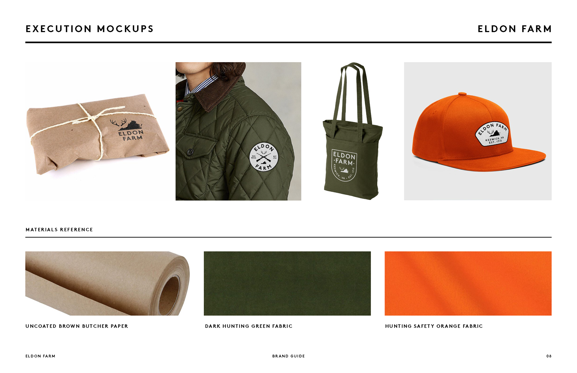
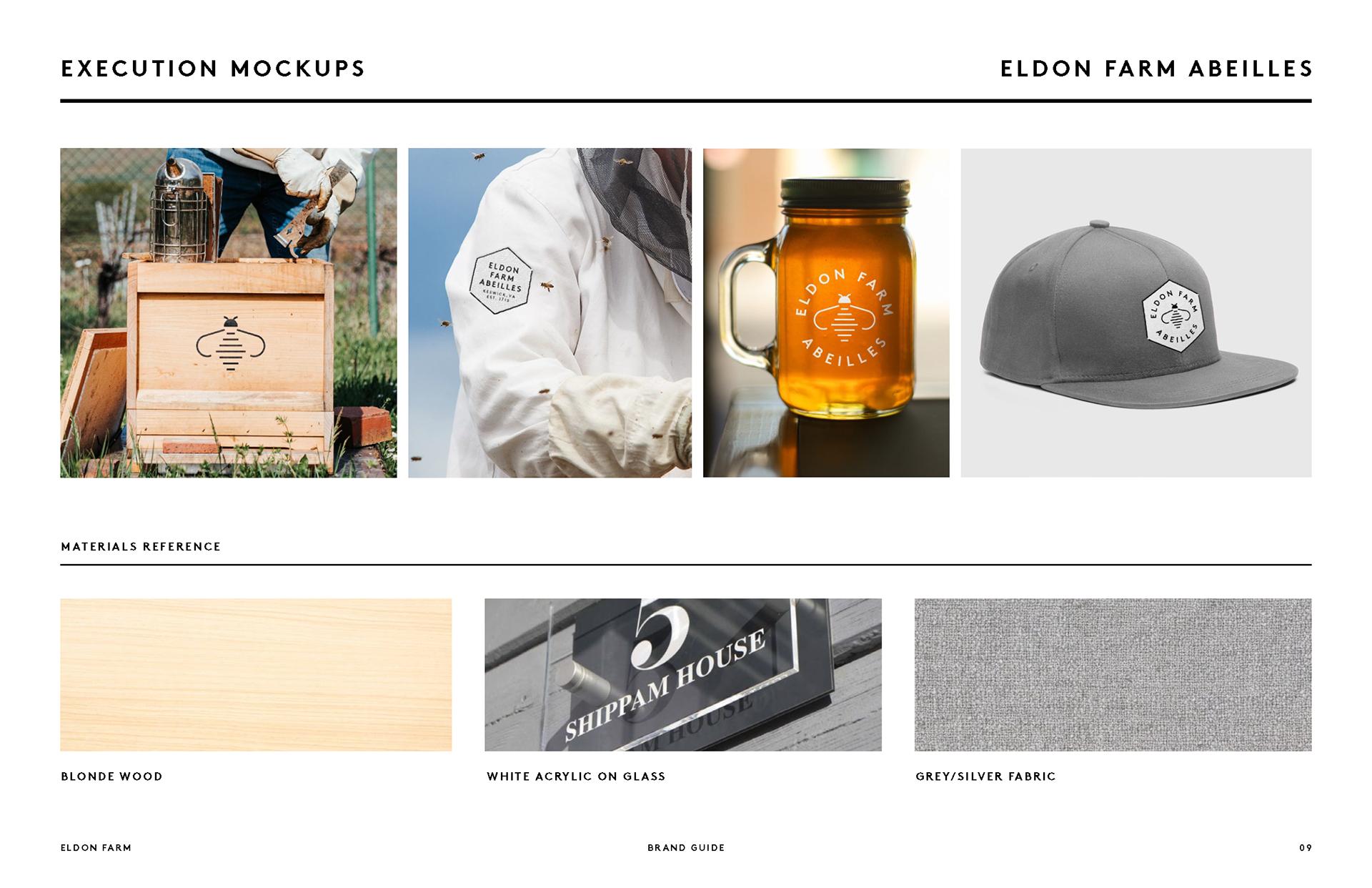
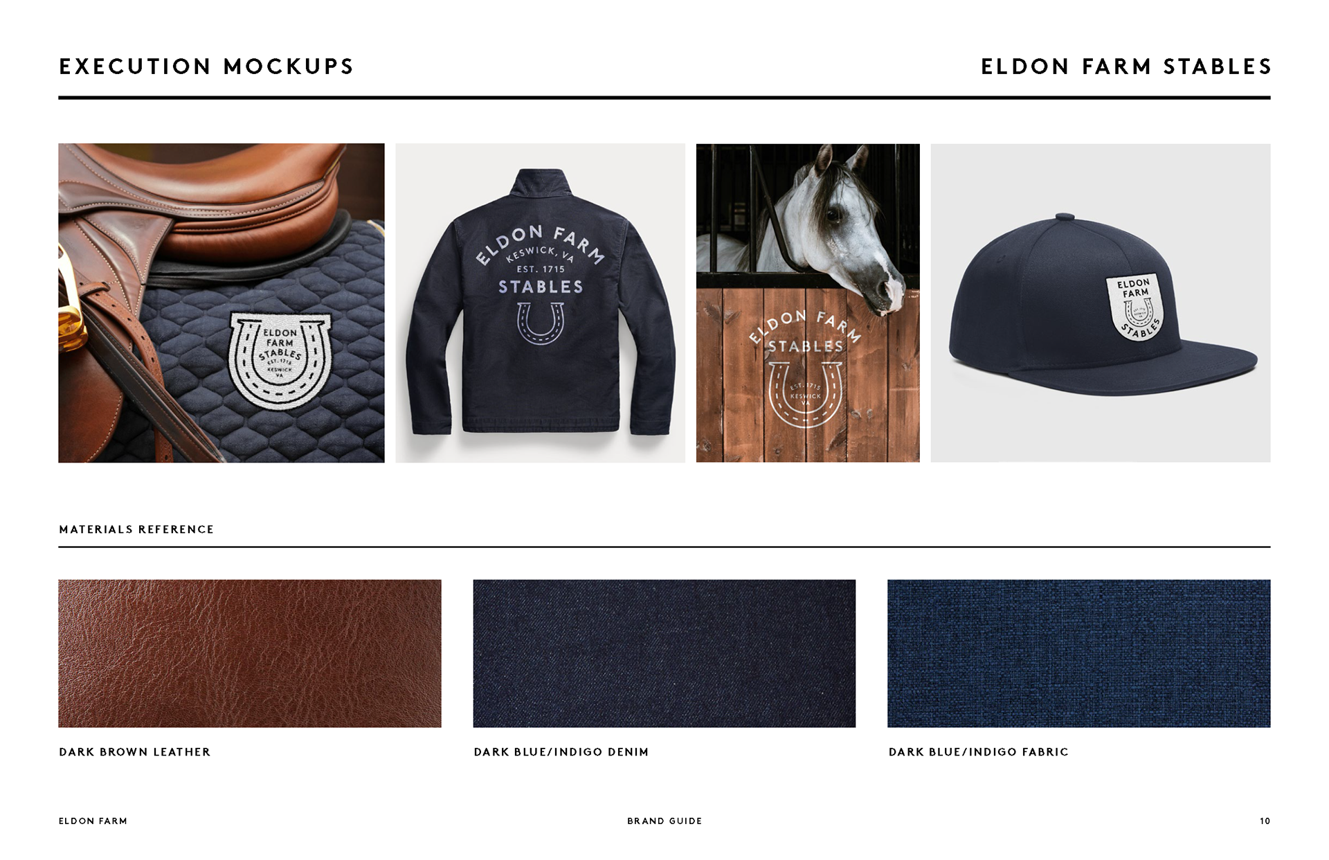
Why stop at deer when you’ve got horses, bees, and wagyu cattle in the mix?
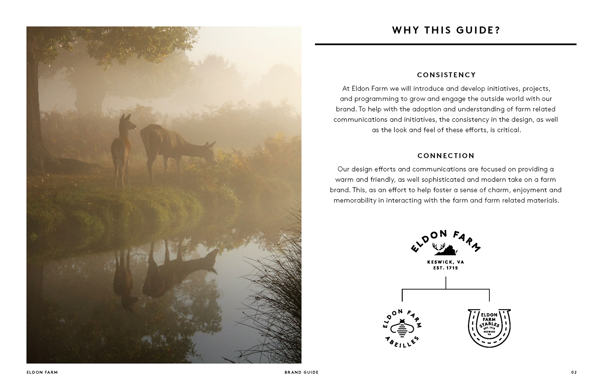
What started as a single logo for a Virginia hunting lodge quickly grew into a full-fledged brand ecosystem — Eldon Farm evolved into a suite of distinct-yet-cohesive identities: a rustic, heritage-driven mark for the main farm, an elegant emblem for the stables, a refined insignia for Eldon Farm Abeilles (its beekeeping operation), and finally, a bold new badge for Eldon Farm Wagyu.
Each one stands strong on its own, but together, they tell the full story of a place where tradition, nature, and premium craftsmanship meet.


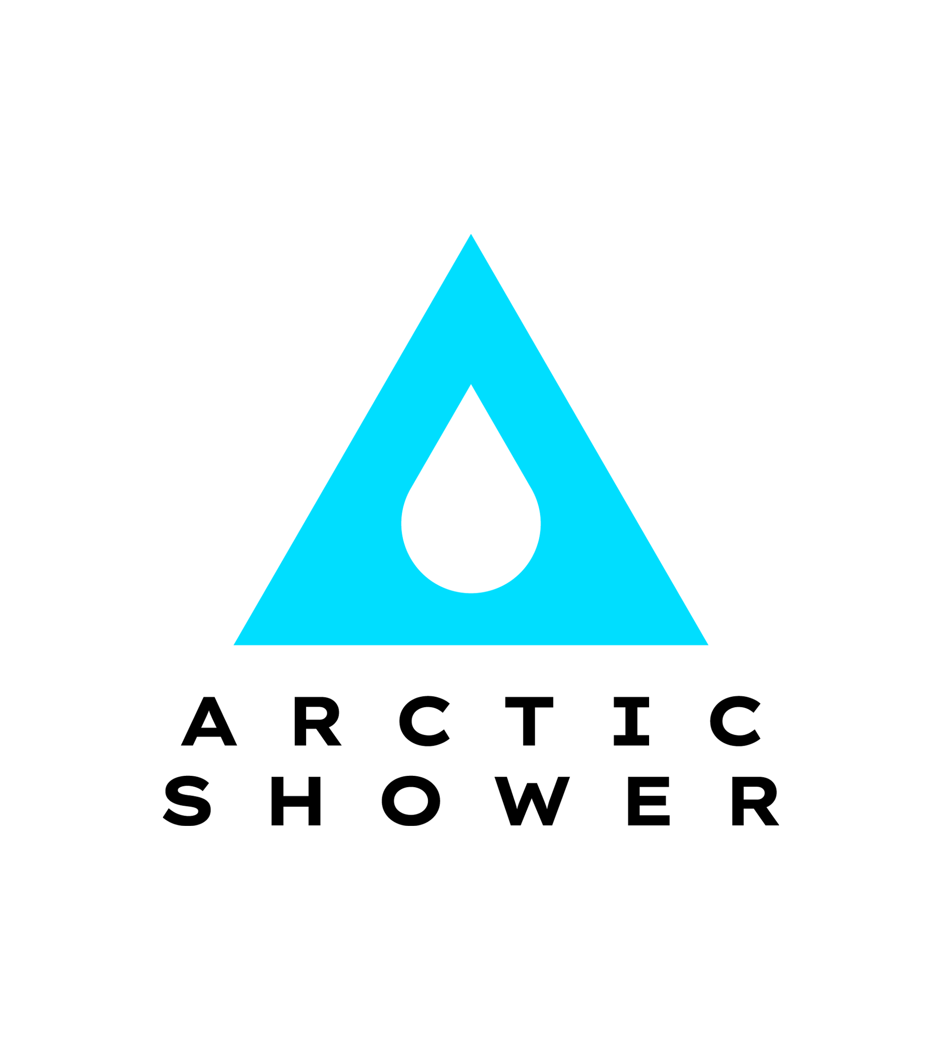
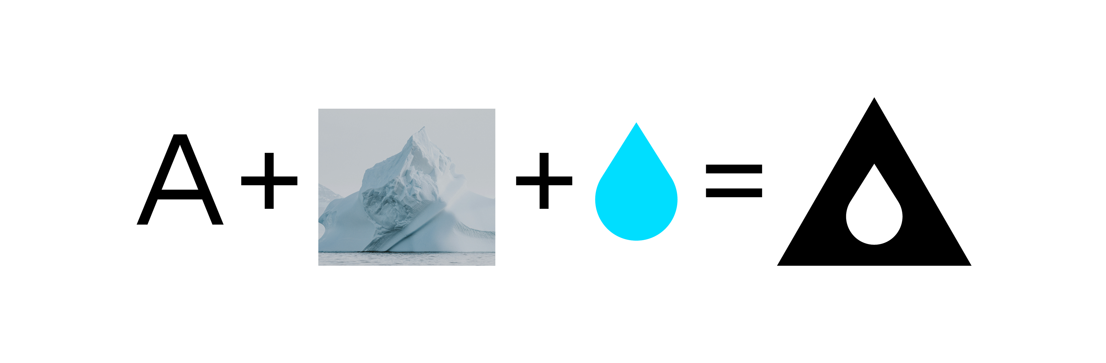
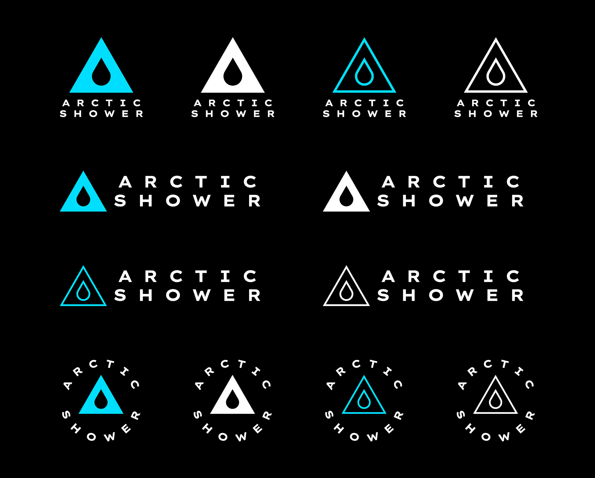
Cold therapy is serious business.
So is good branding.
Arctic Shower needed a sharp, adaptable identity — so I designed a logo that’s as streamlined as the product itself: a simple yet bold ‘A’ shaped like a water droplet (and, if you look long enough, an iceberg — because, you know, Arctic).
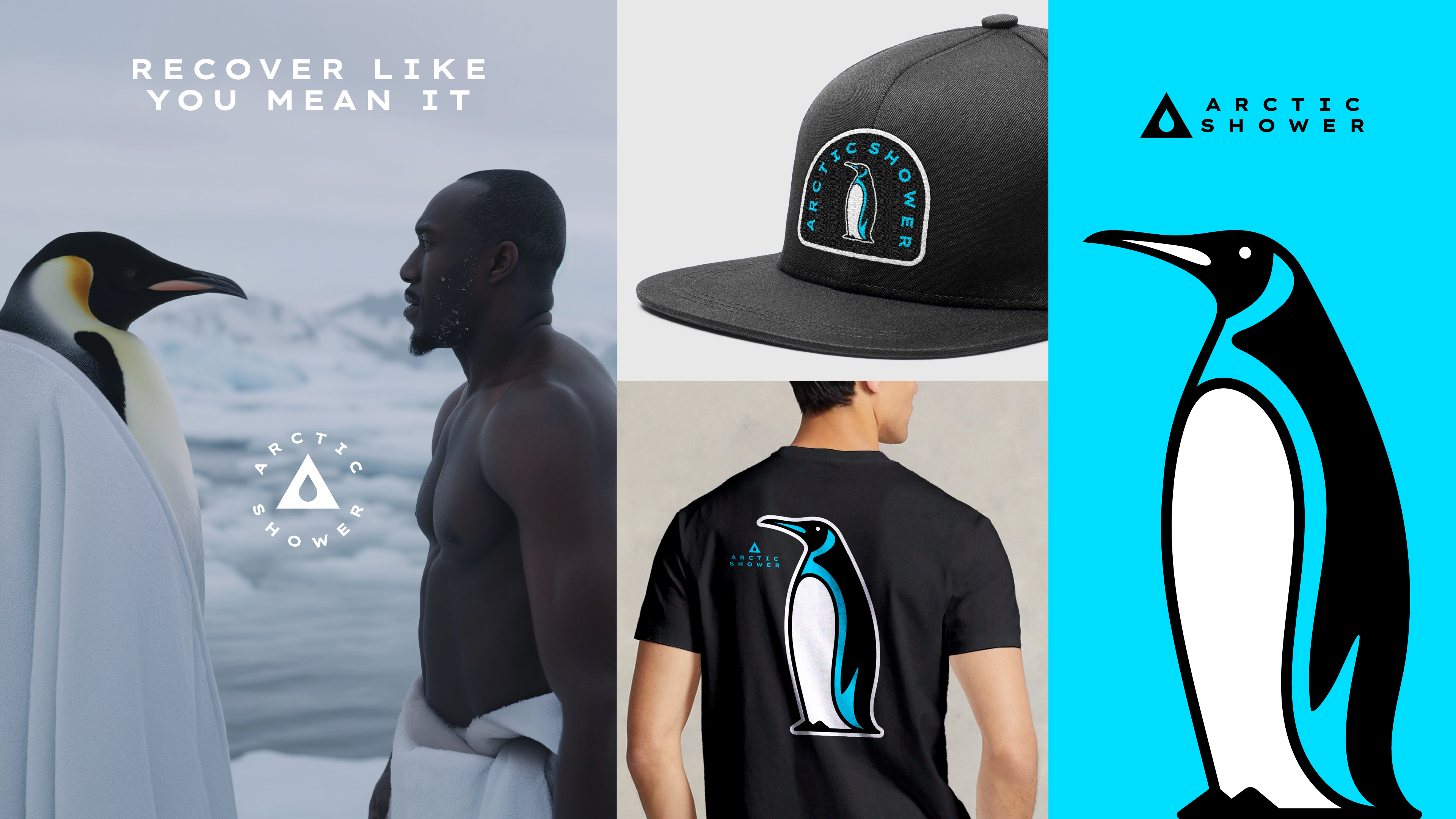
Then, because I can’t help myself, I introduced a penguin as a potential brand mascot, because nothing says “ice bath” like nature’s most committed cold-plunge enthusiast.
And for the pièce de résistance? A concept ad featuring said penguin, wrapped in a bath towel, standing toe-to-toe with a world class track star. Ridiculous? Absolutely. But hey, branding should be memorable.
Refining a new brand to match the timeless aspirations of its founder.
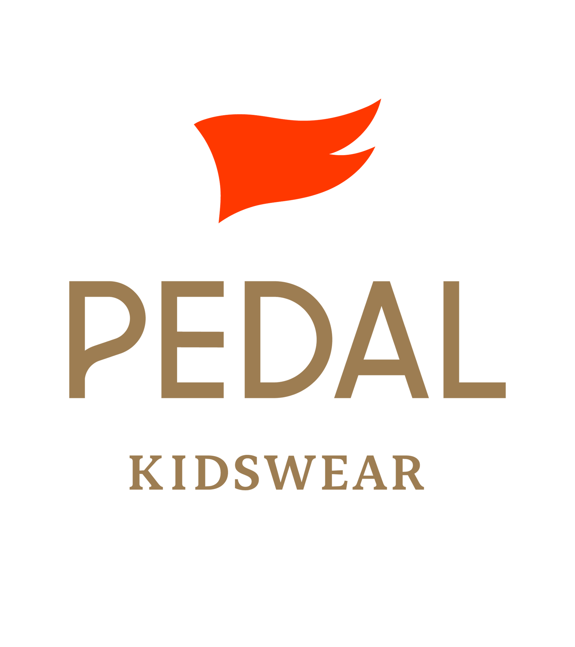
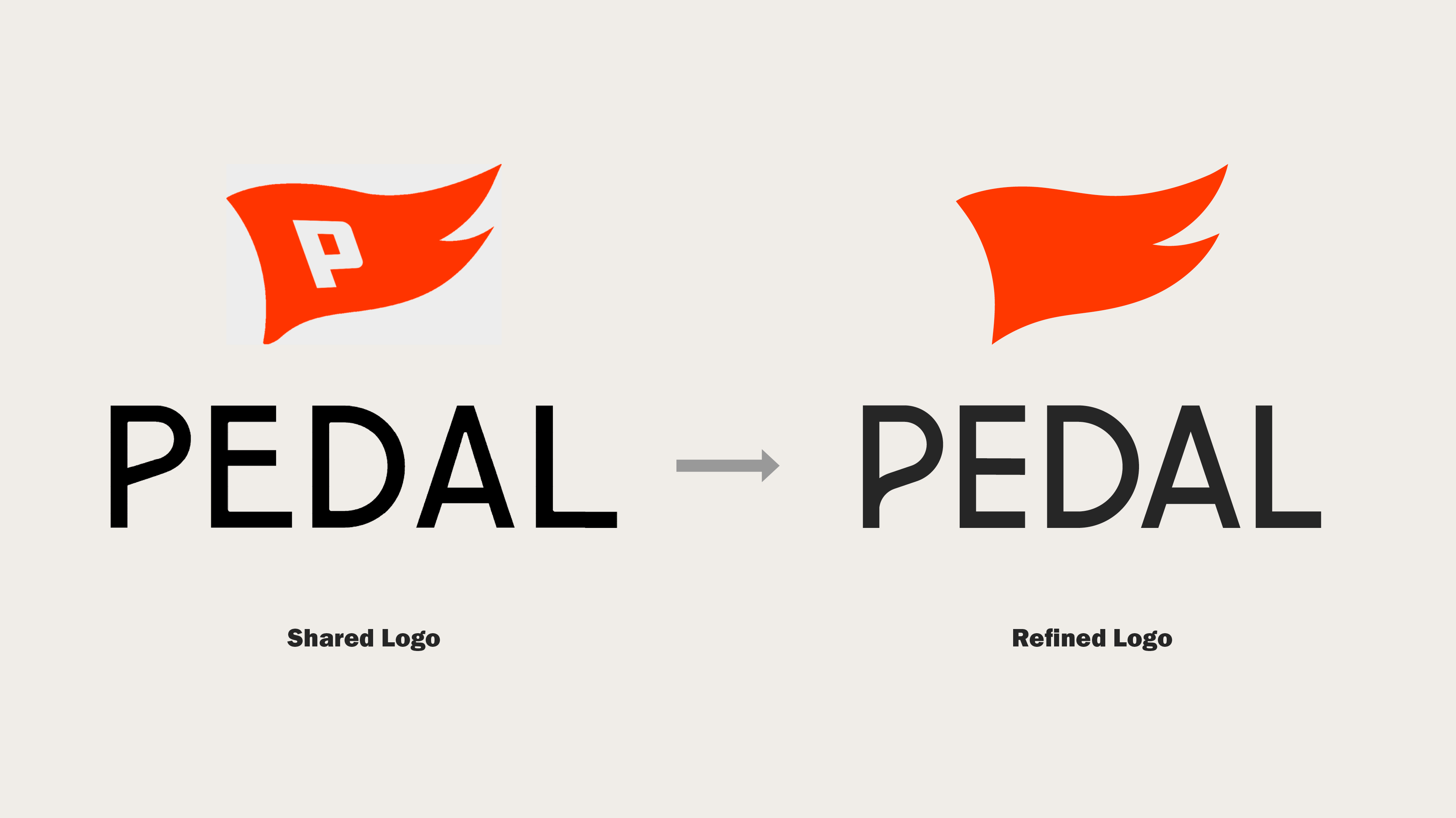
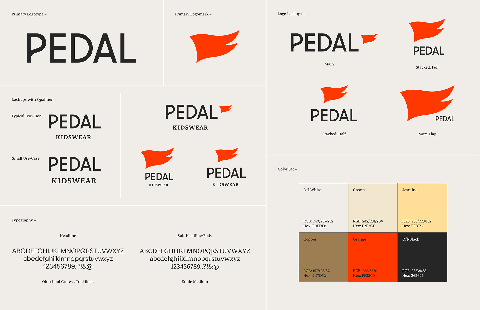
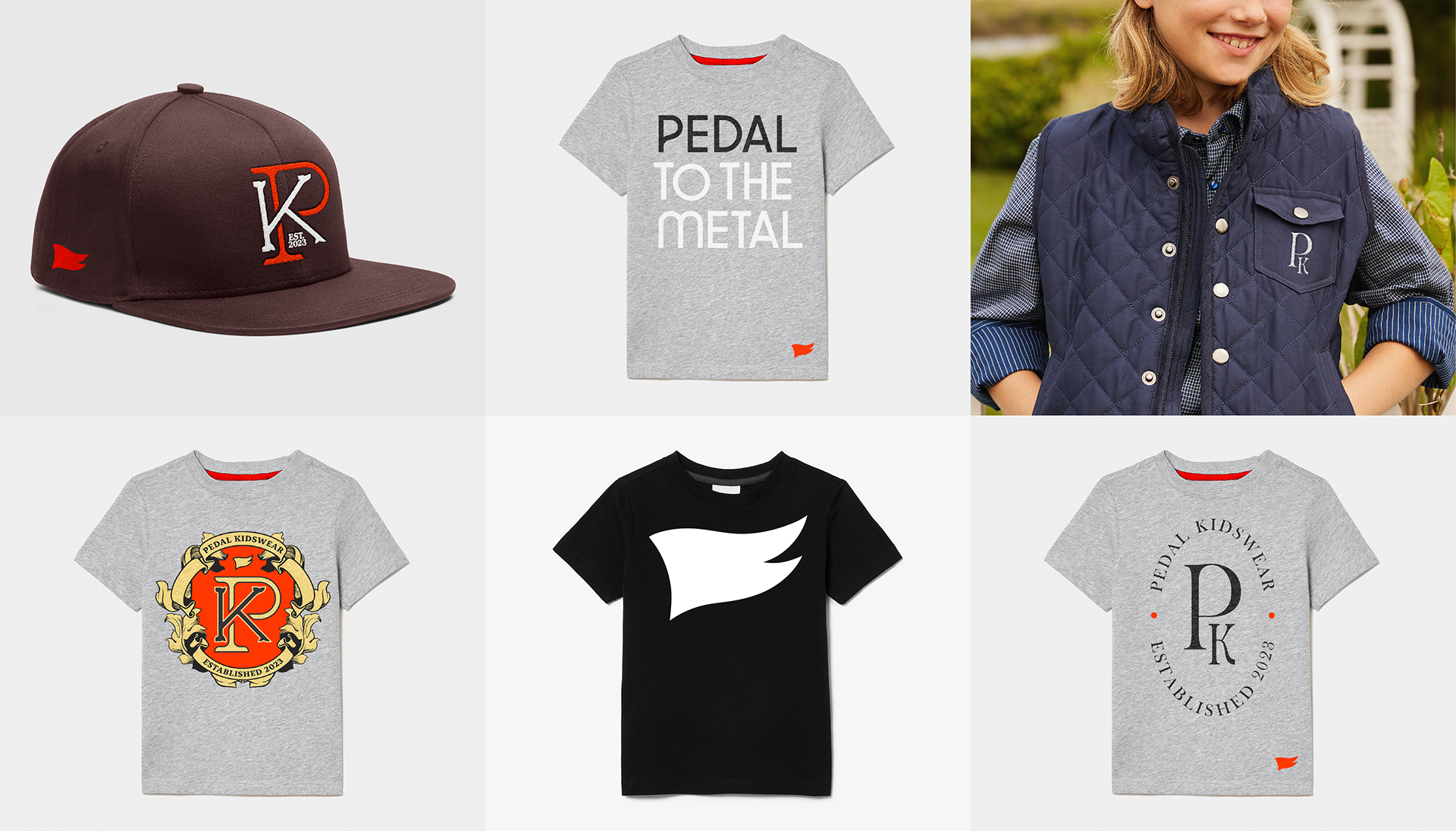
Sometimes a brand just needs a professional polish. Pedal Kidswear had the right idea with its classic, adventurous vibe, but the execution needed some refinement.
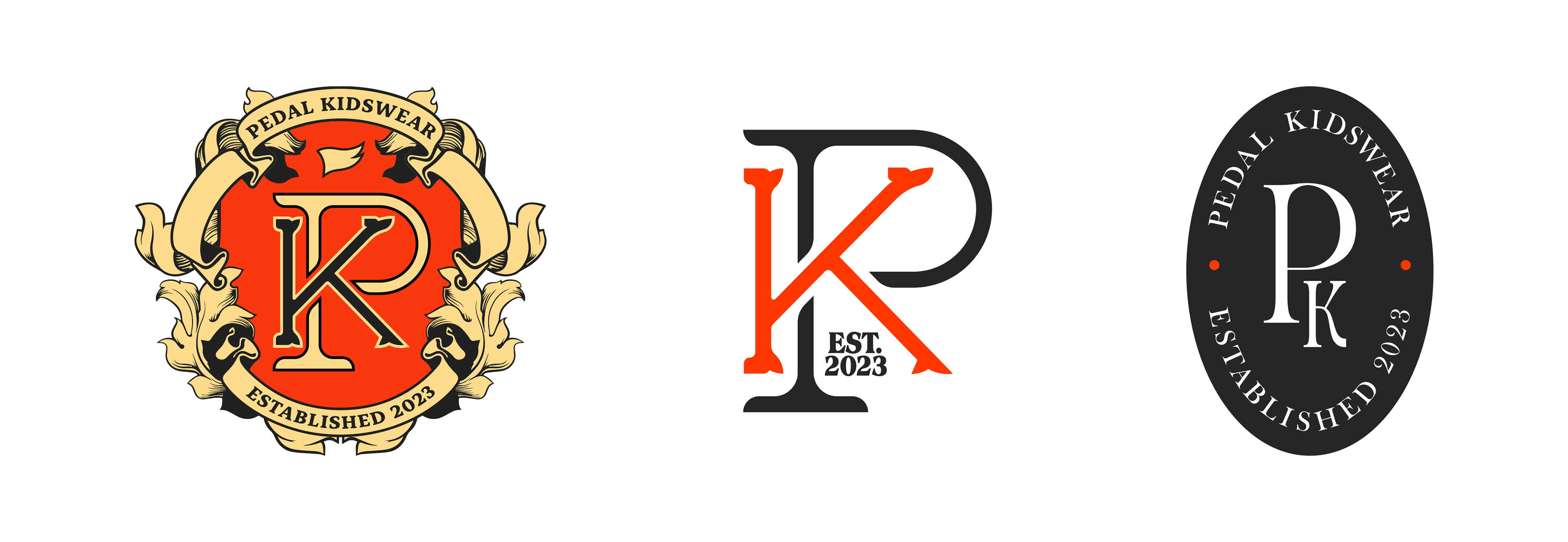
I cleaned up the logotype while adding some distinction, tightened up the flag logomark, and brought in a refreshed color palette, stronger typography, and punchier art direction. Alongside these updates, I crafted heritage-inspired sub-brand designs, perfect for apparel graphics, to further elevate the brand’s cohesive and timeless feel.
The result? A brand that’s both timeless and fresh — just like the clothes that’ll dawn it.

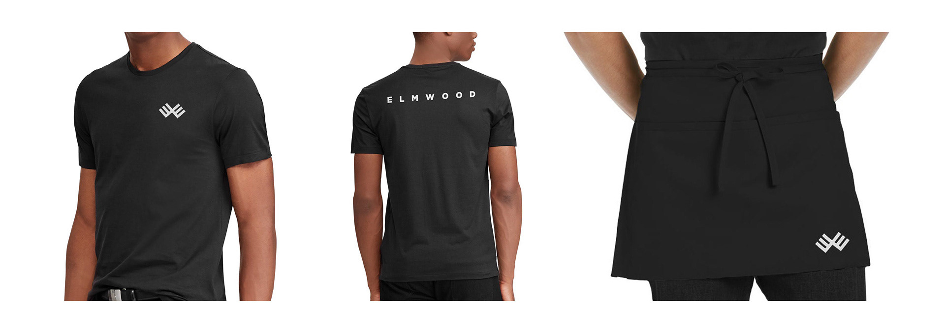
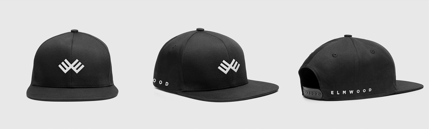
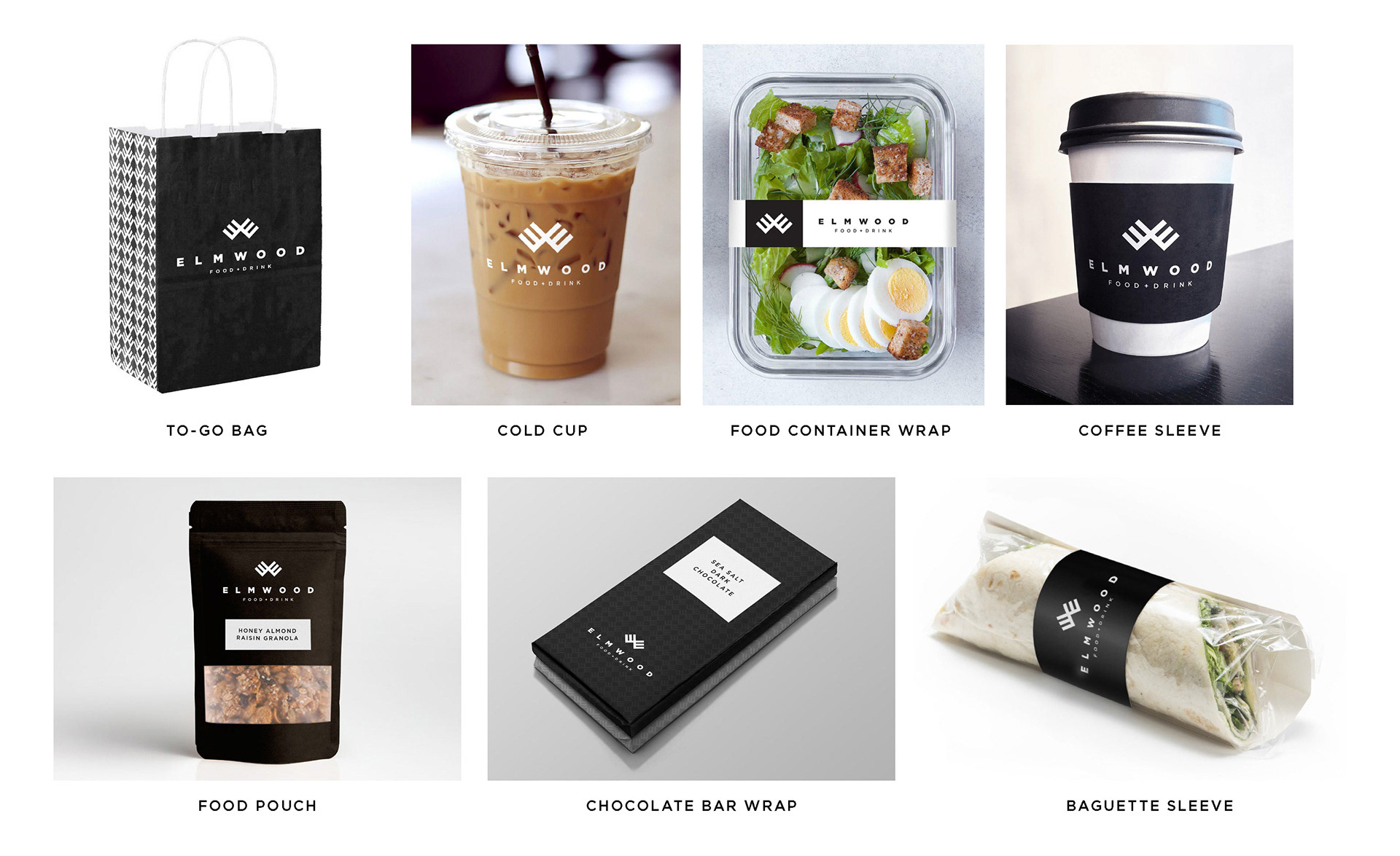
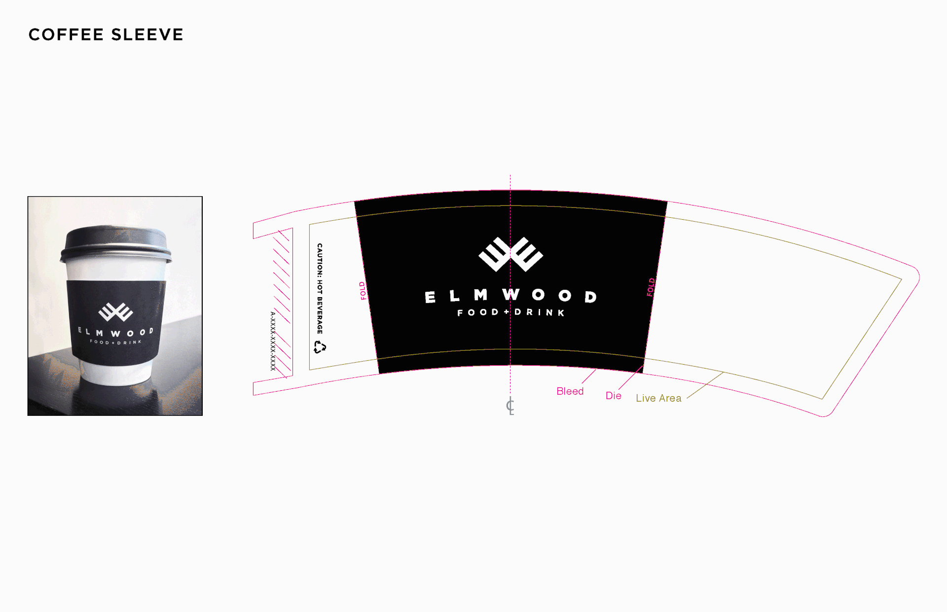
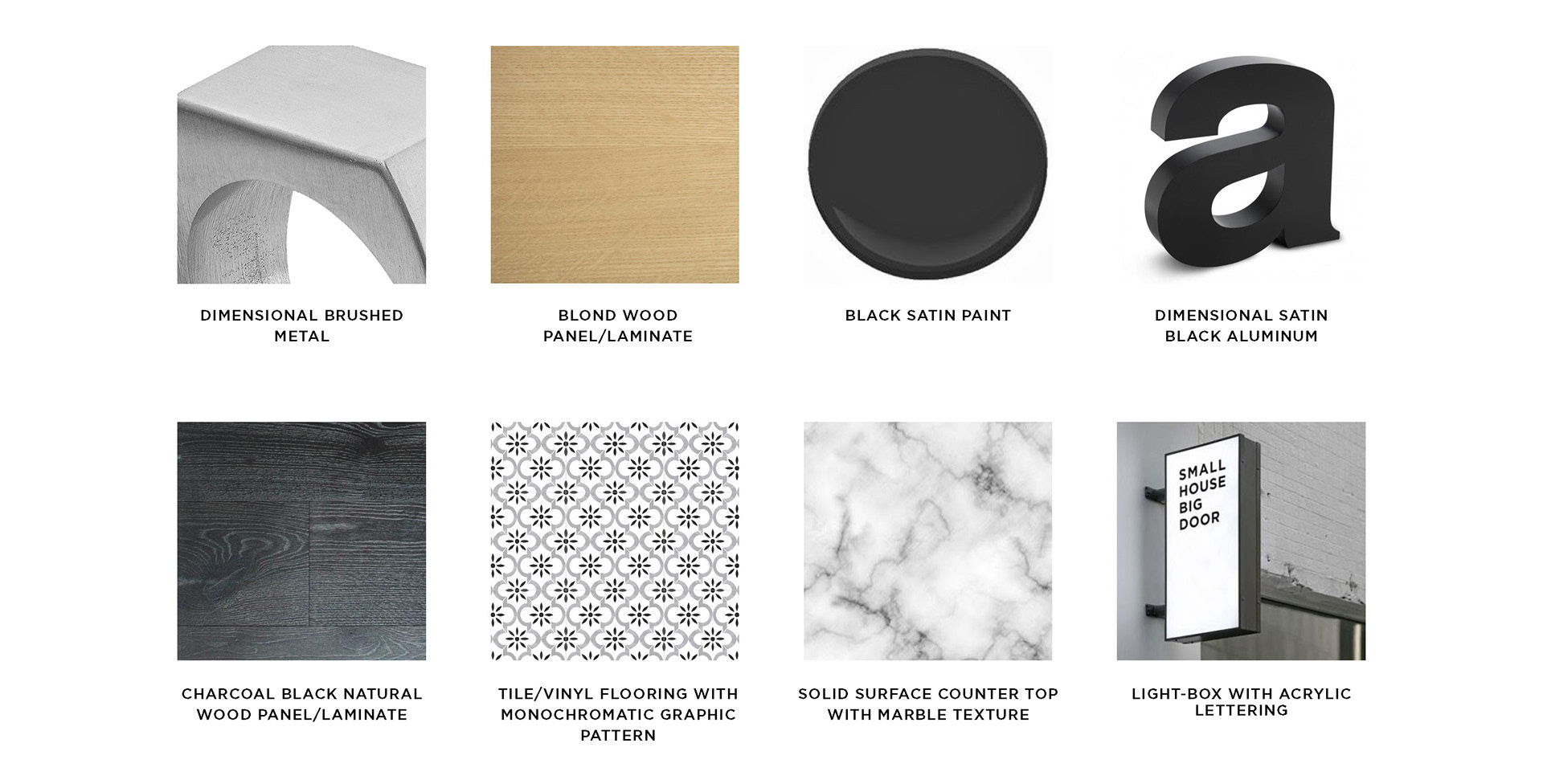
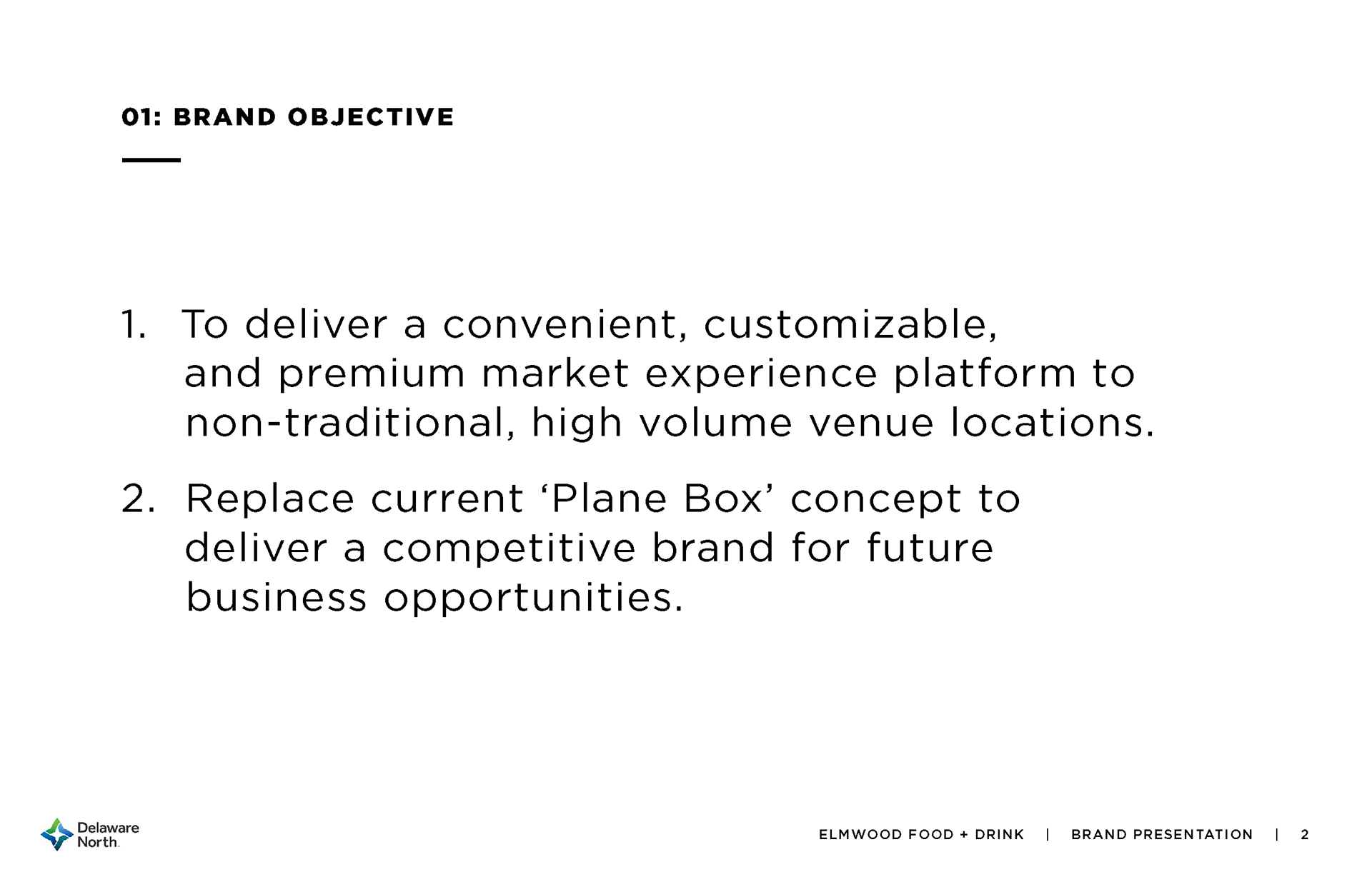
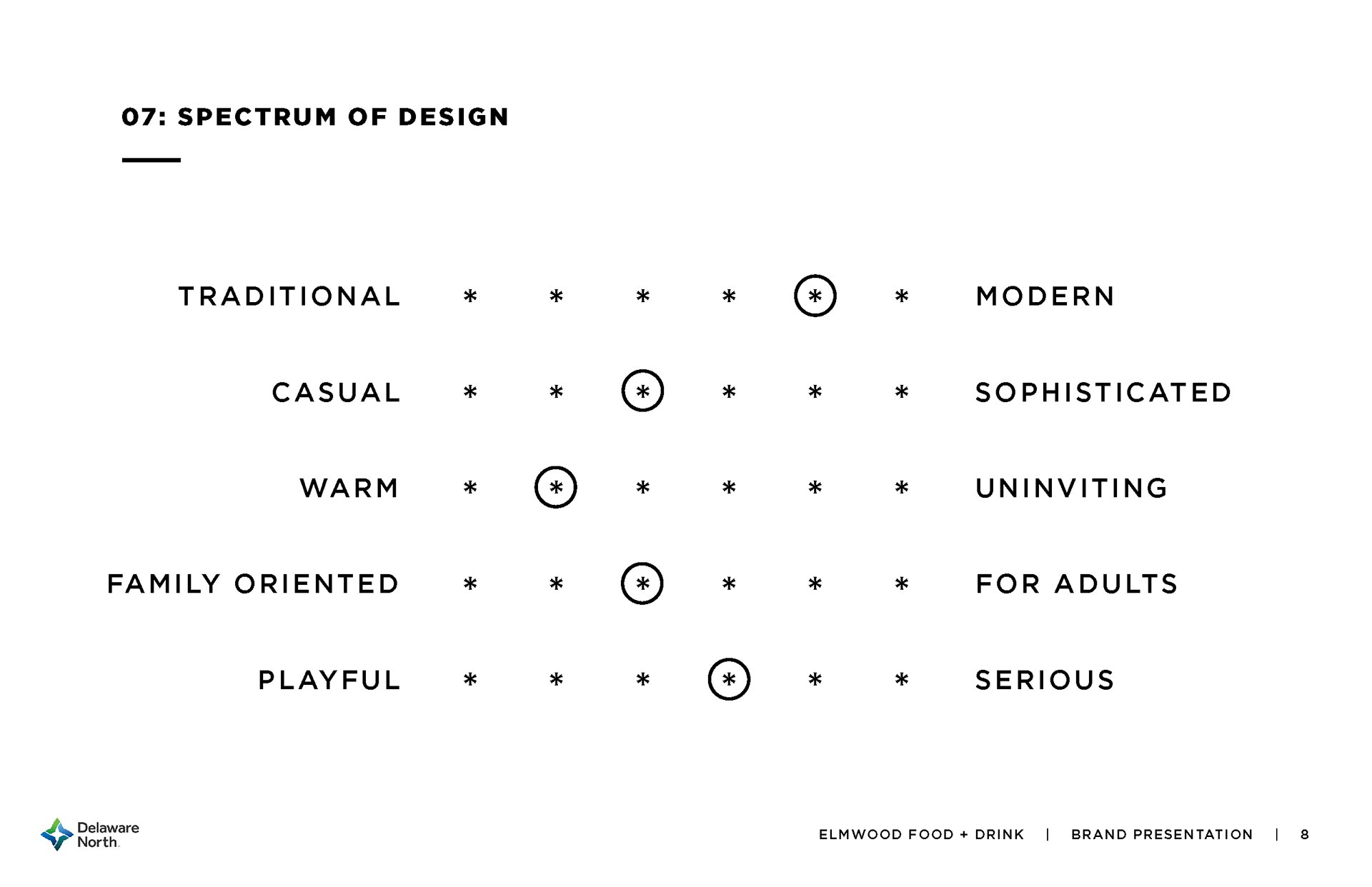
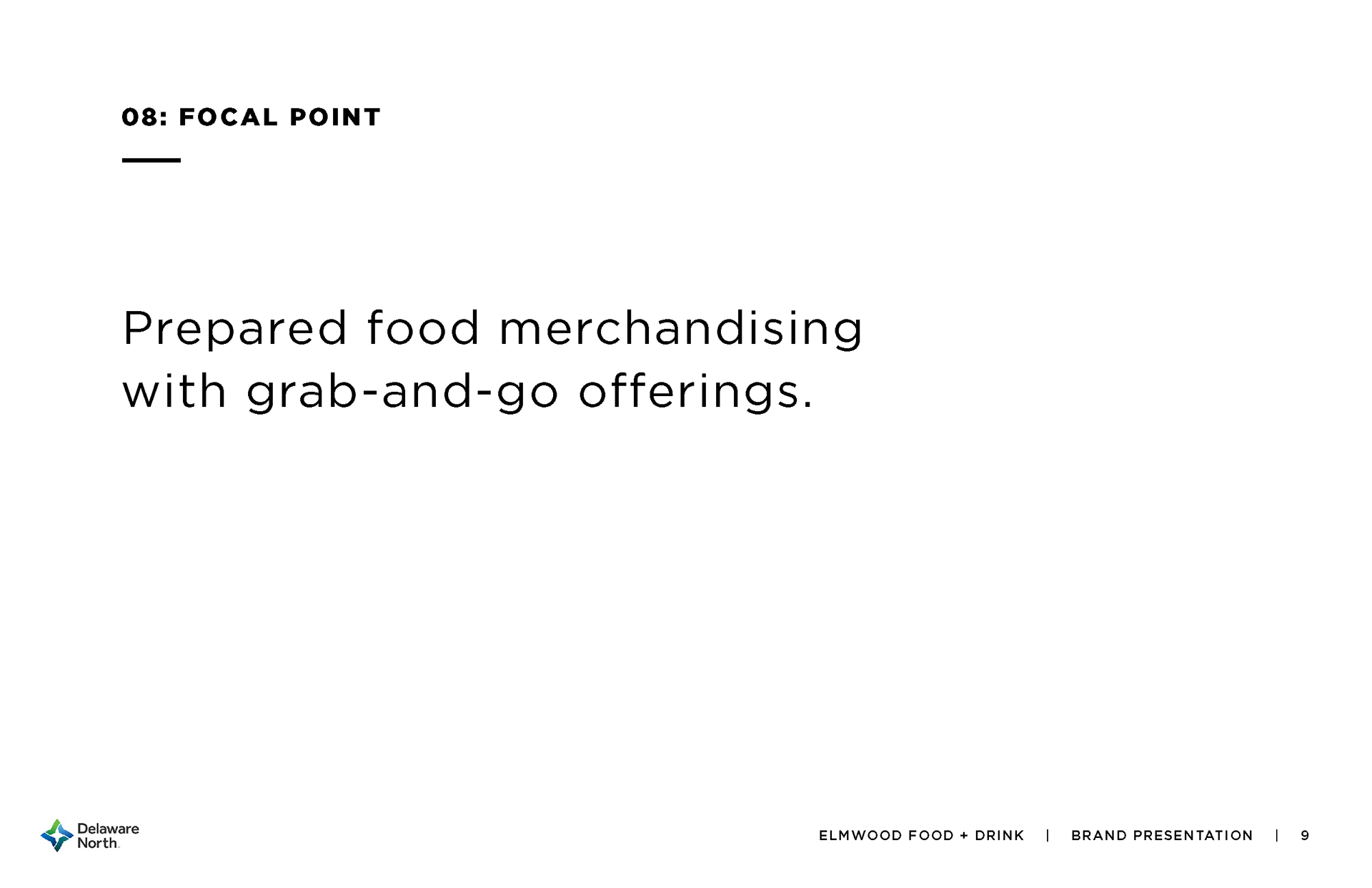
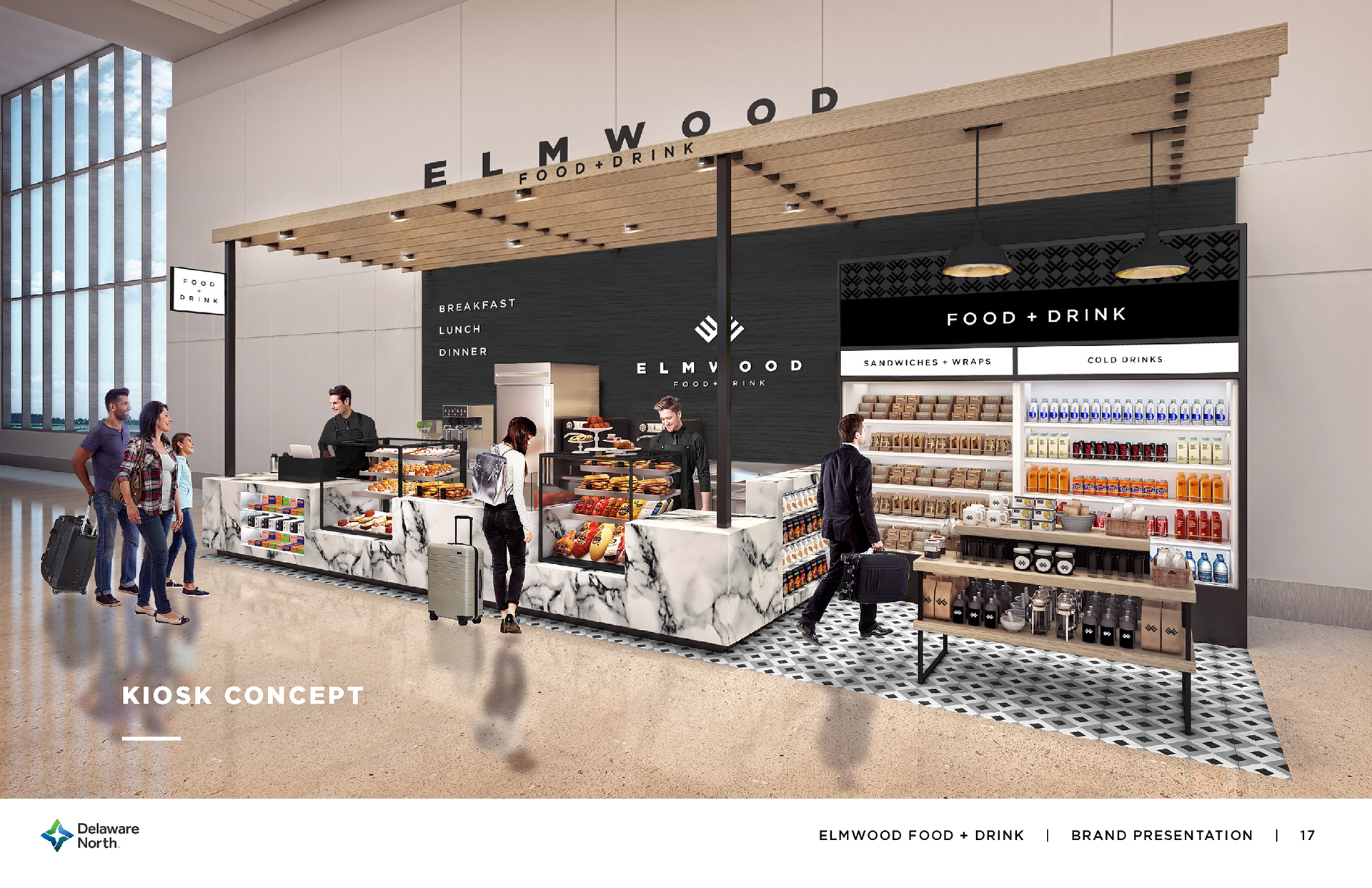
A grab-and-go food service concept designed to make a lasting impression before takeoff.
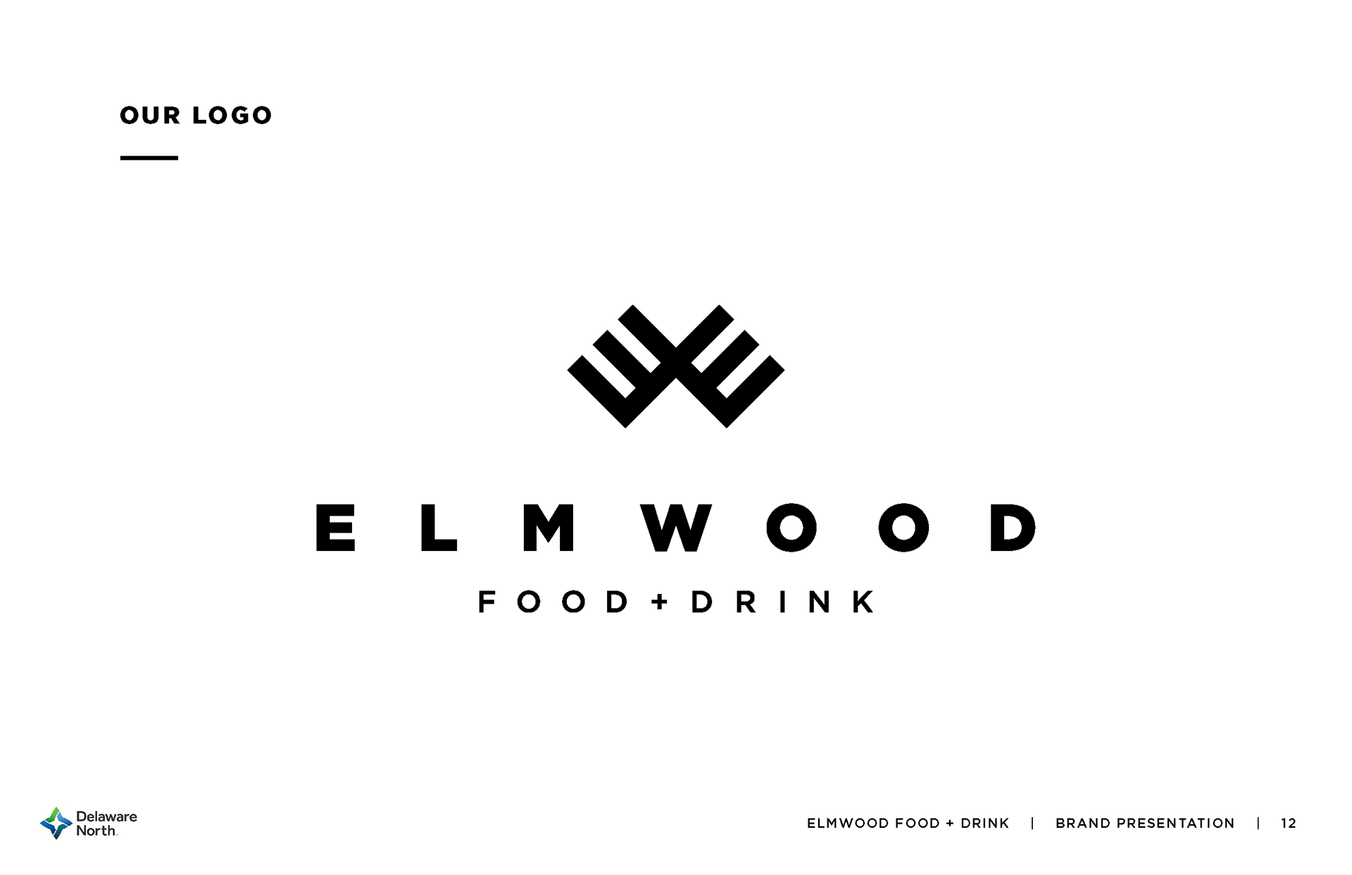
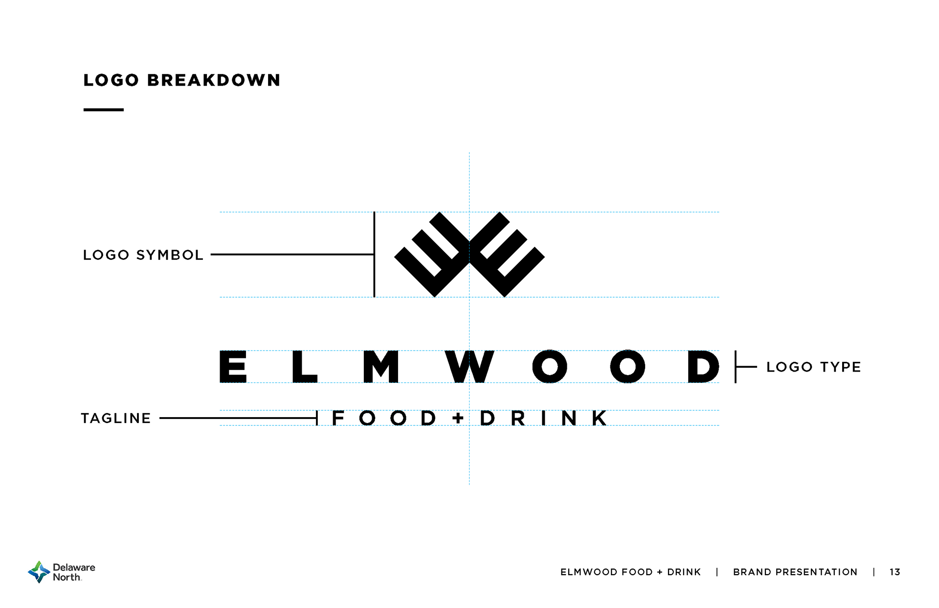
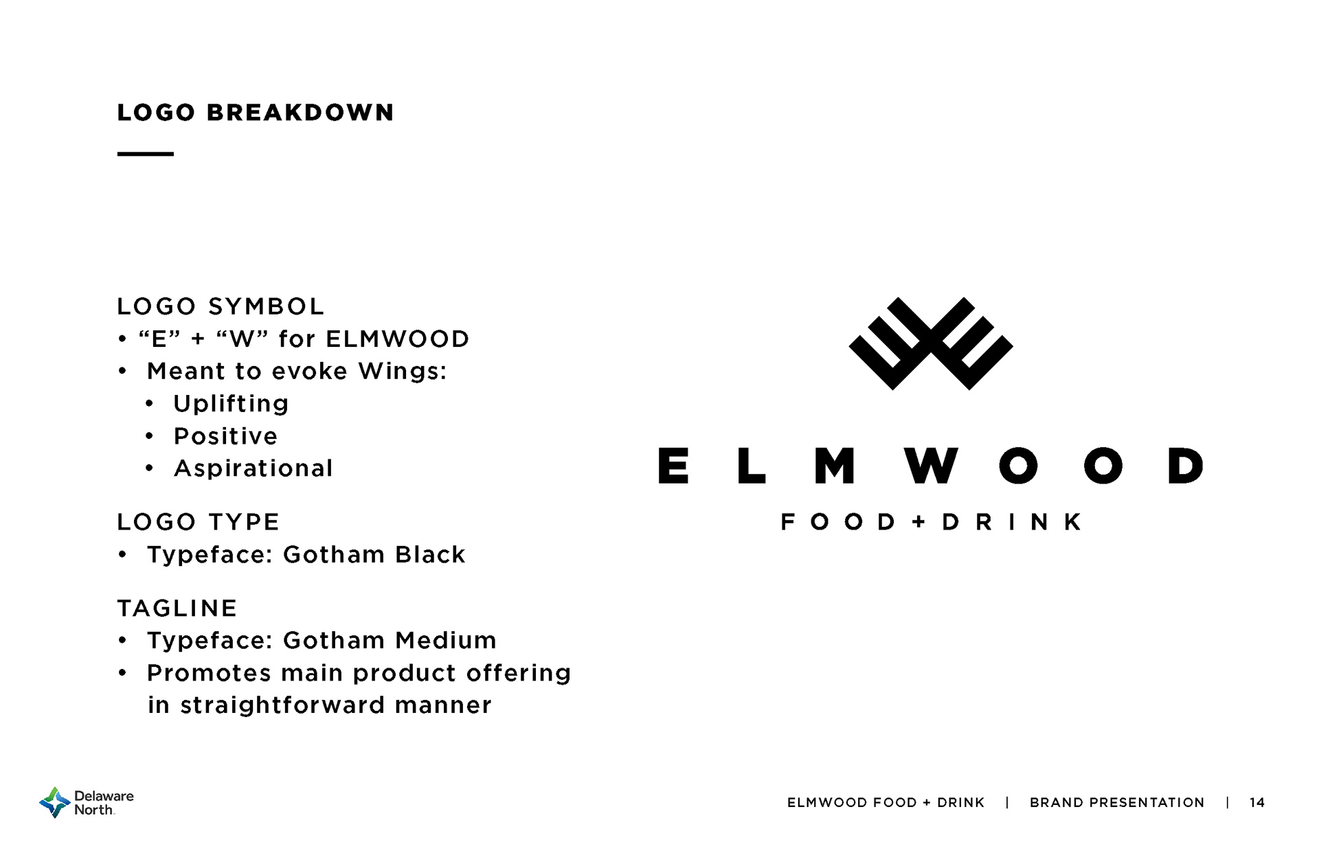
Delaware North came with a mission to elevate airport grab-and-go dining. The result? Elmwood Food + Drink. I worked alongside the team to name the brand, then designed the minimal, sleek branding with a logomark combining an "E" and "W" into a set of wings — a nod to why folks are at the airport in the first place.
The branding package expanded to worker uniforms, packaging, and even early concepts for in-space graphics and signage. Every element was crafted to reinforce the brand’s high-end feel, from the color palette to the modern and timeless typography.


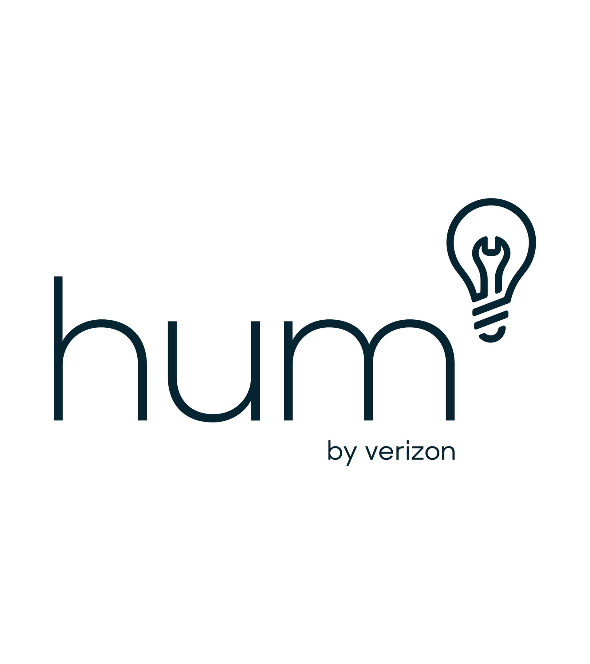
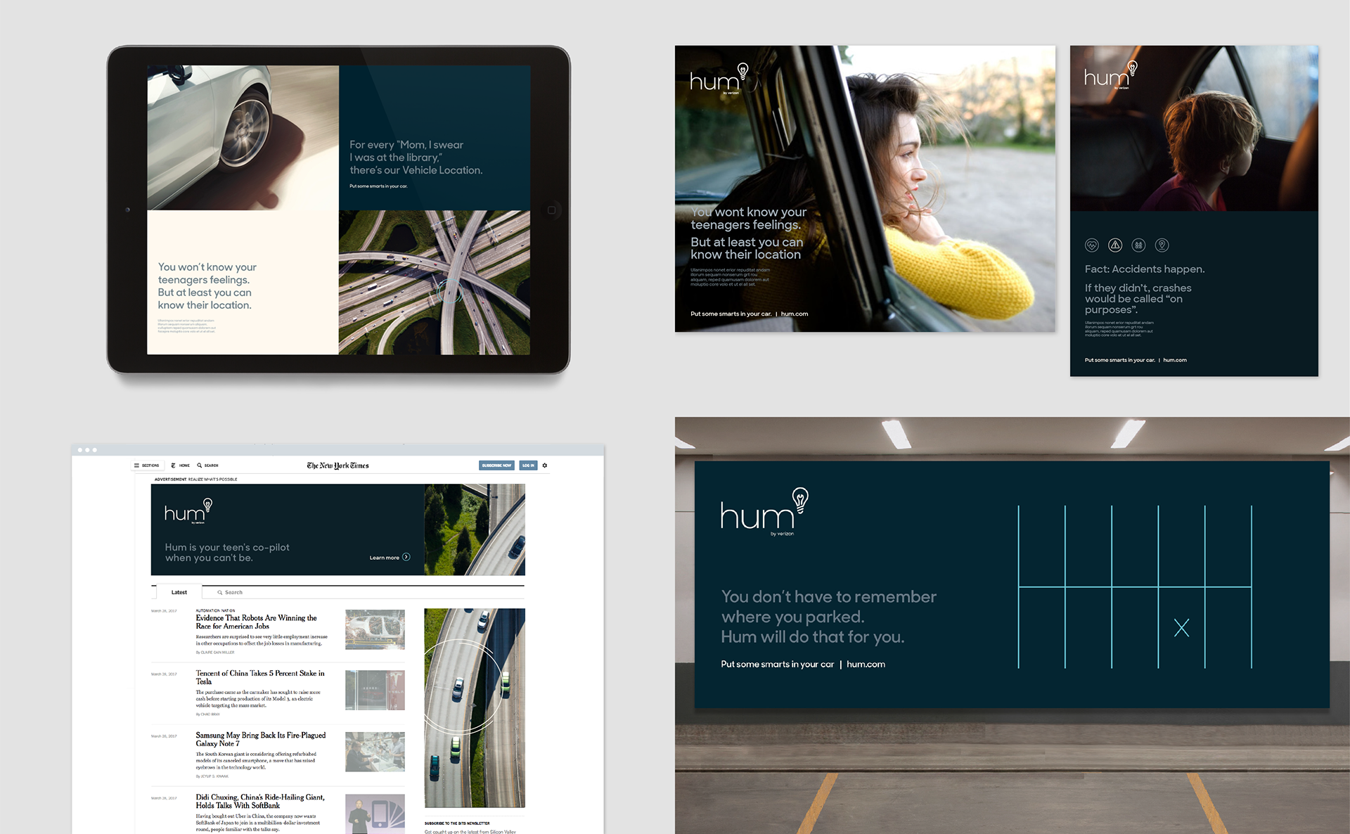
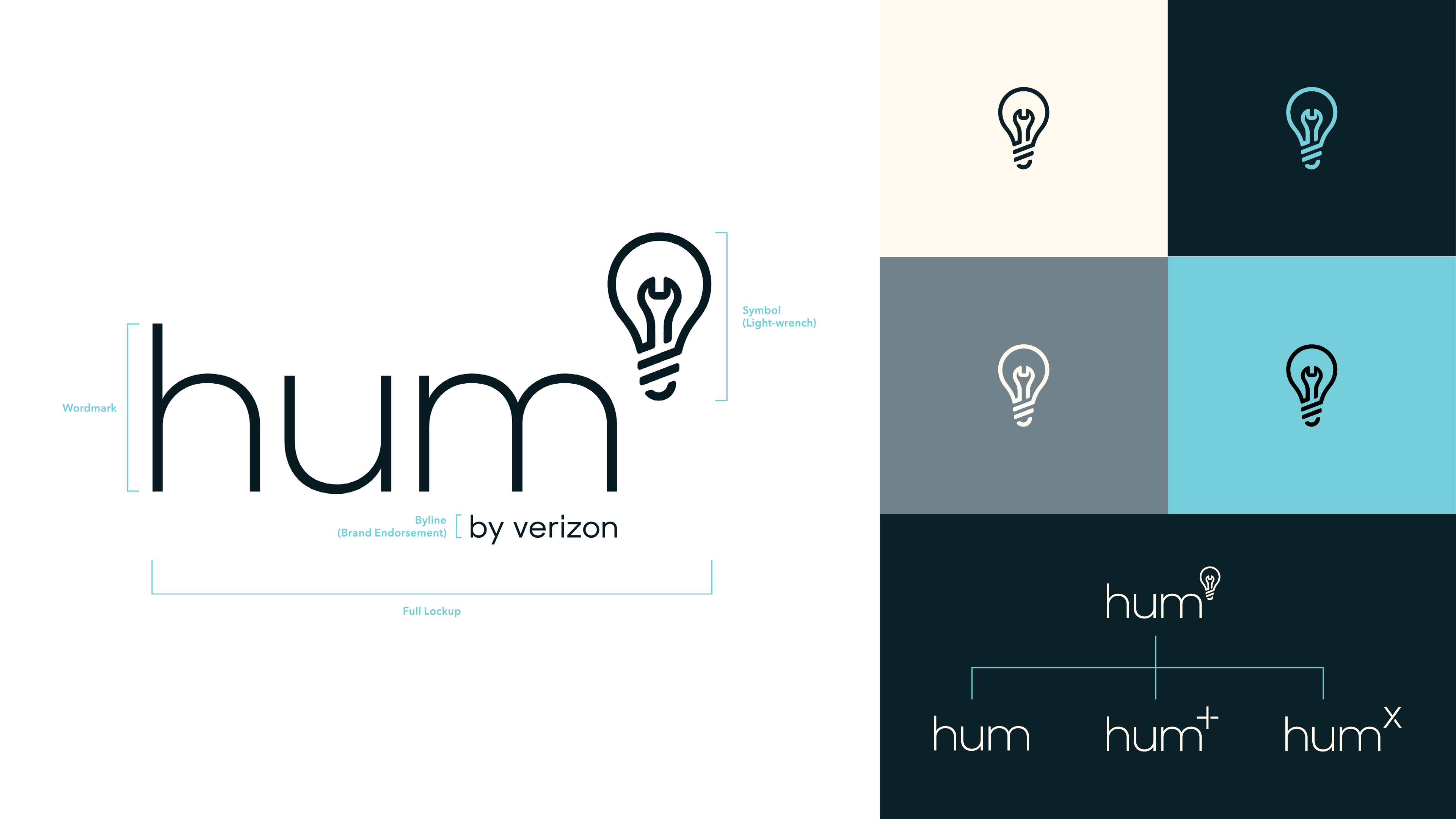
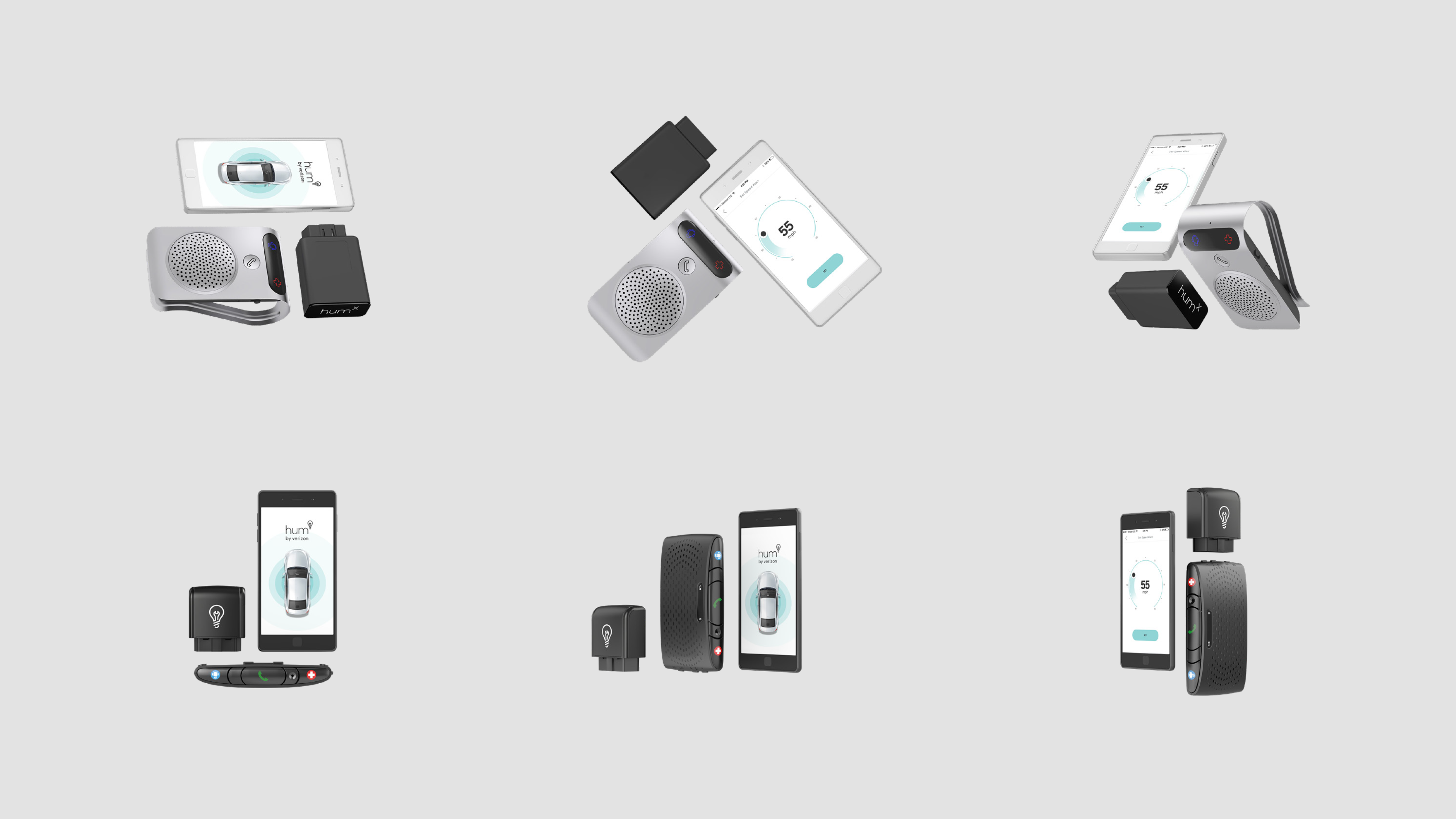
Turning your car into a smarter, friendlier ride with a modern, approachable brand.
When Verizon acquired this innovative car plugin that transforms analog cars into 'smart' vehicles, the branding had to match the tech-forward nature of the product.
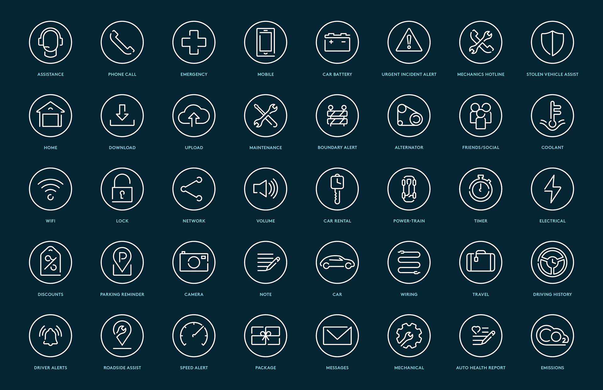
As part of the team, I helped create the preferred direction for the logomark — combining a lightbulb and wrench into the 'lightwrench,' symbolizing innovation and practicality. The branding stuck and I helped build the full visual identity, from crafting the original mark to developing a robust set of icons that would become crucial in both early ads and animated campaigns.

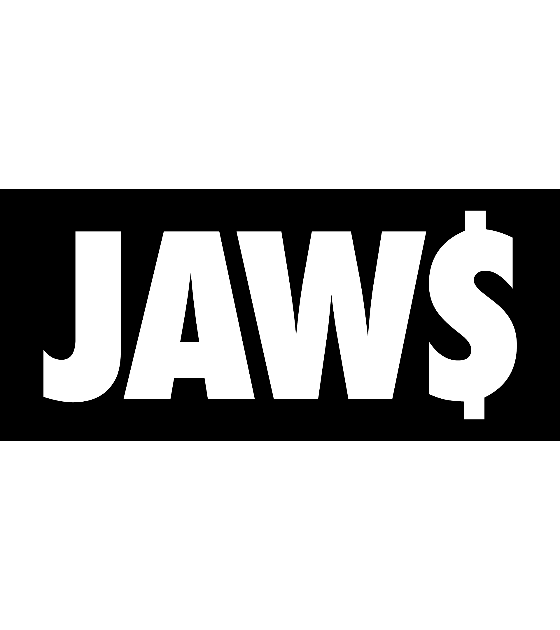
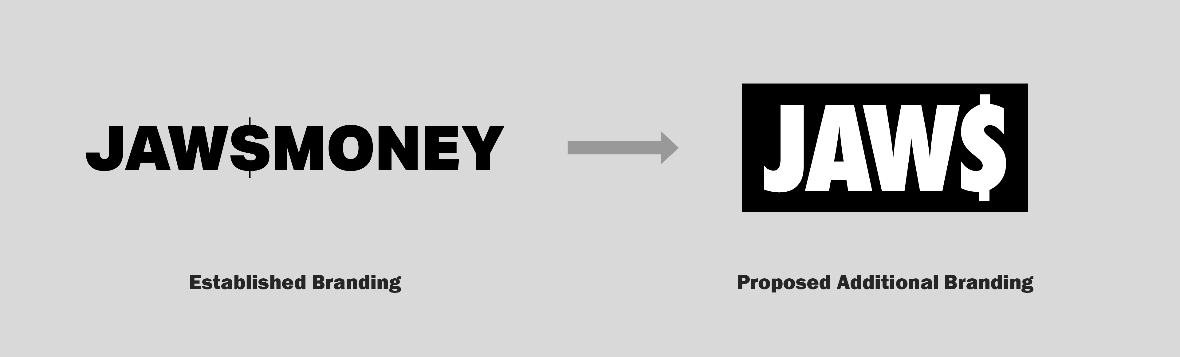
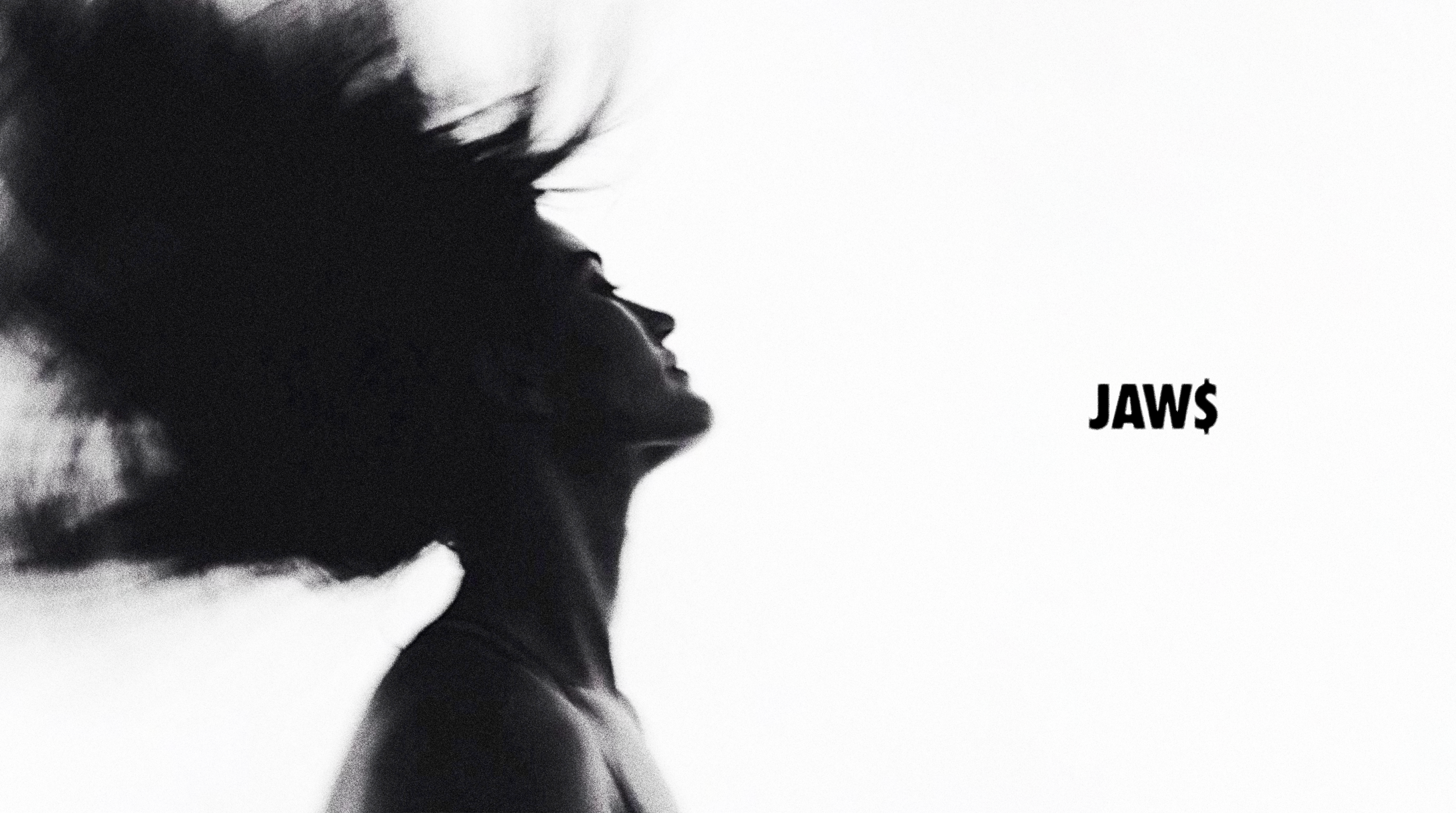
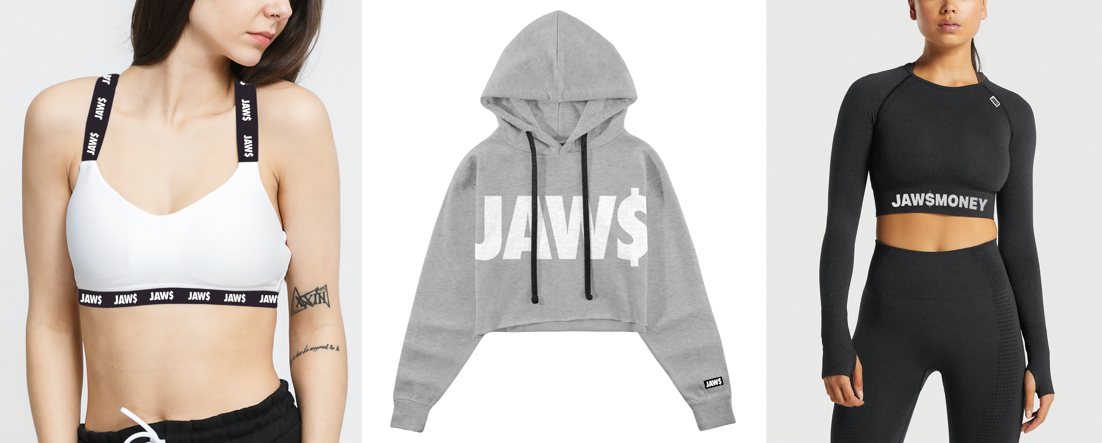
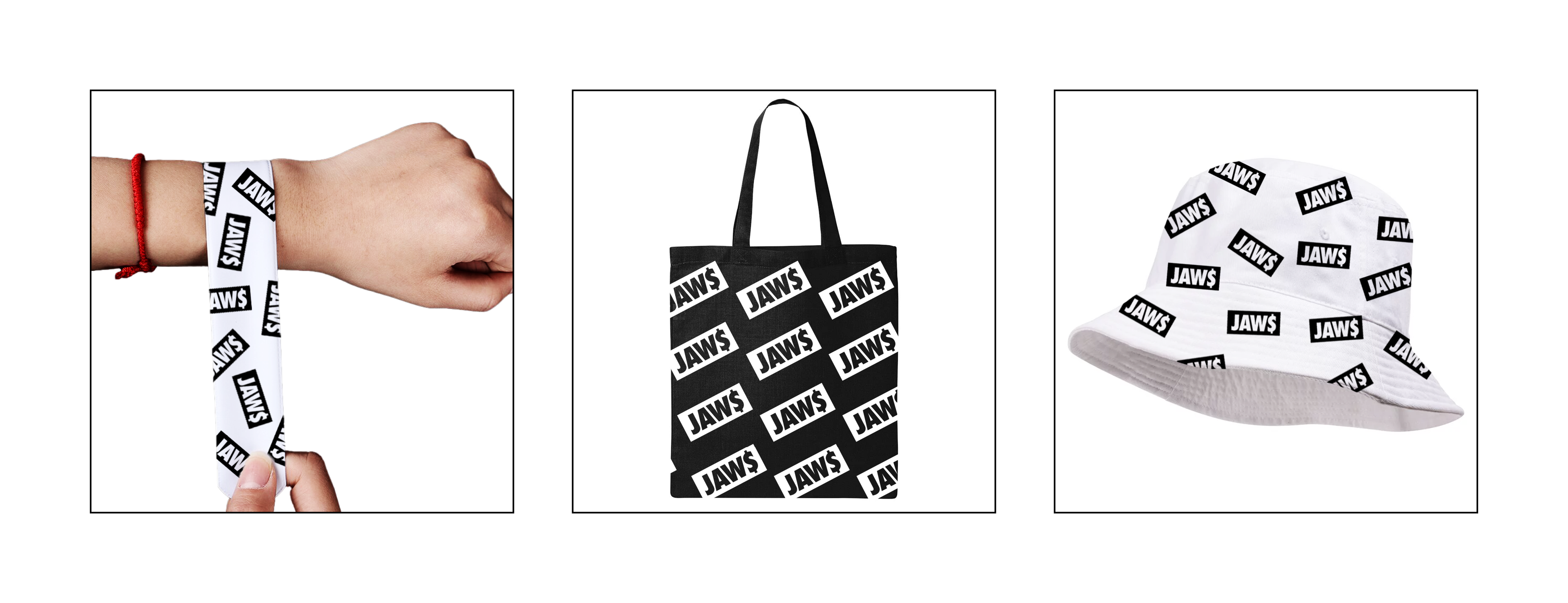
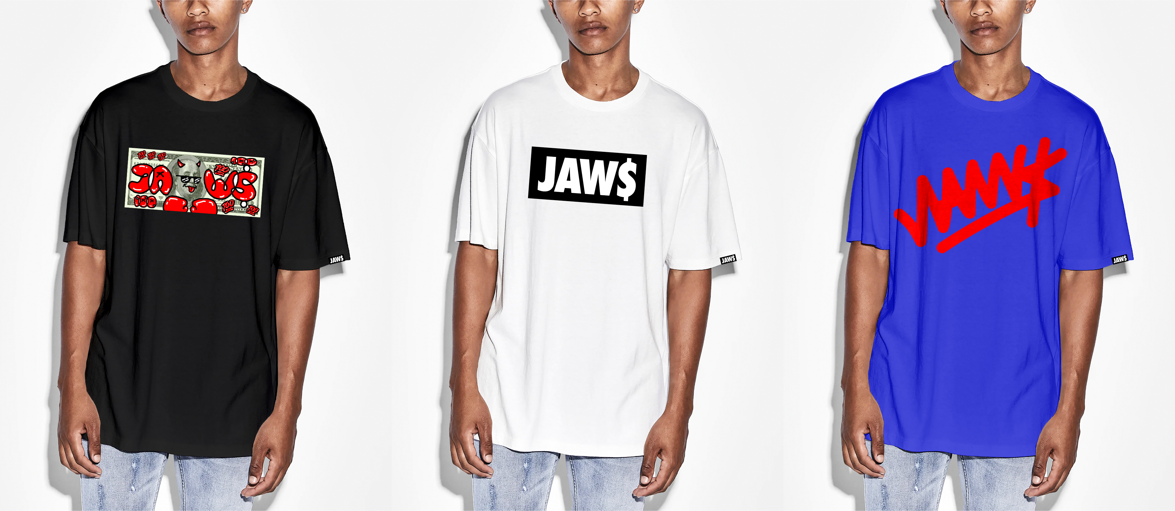
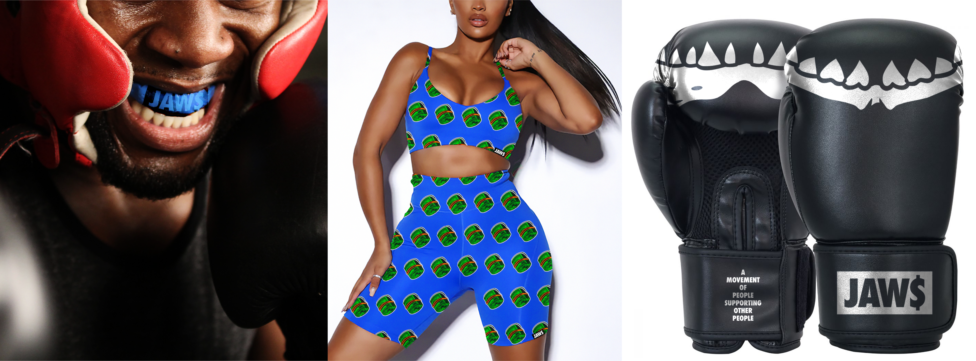
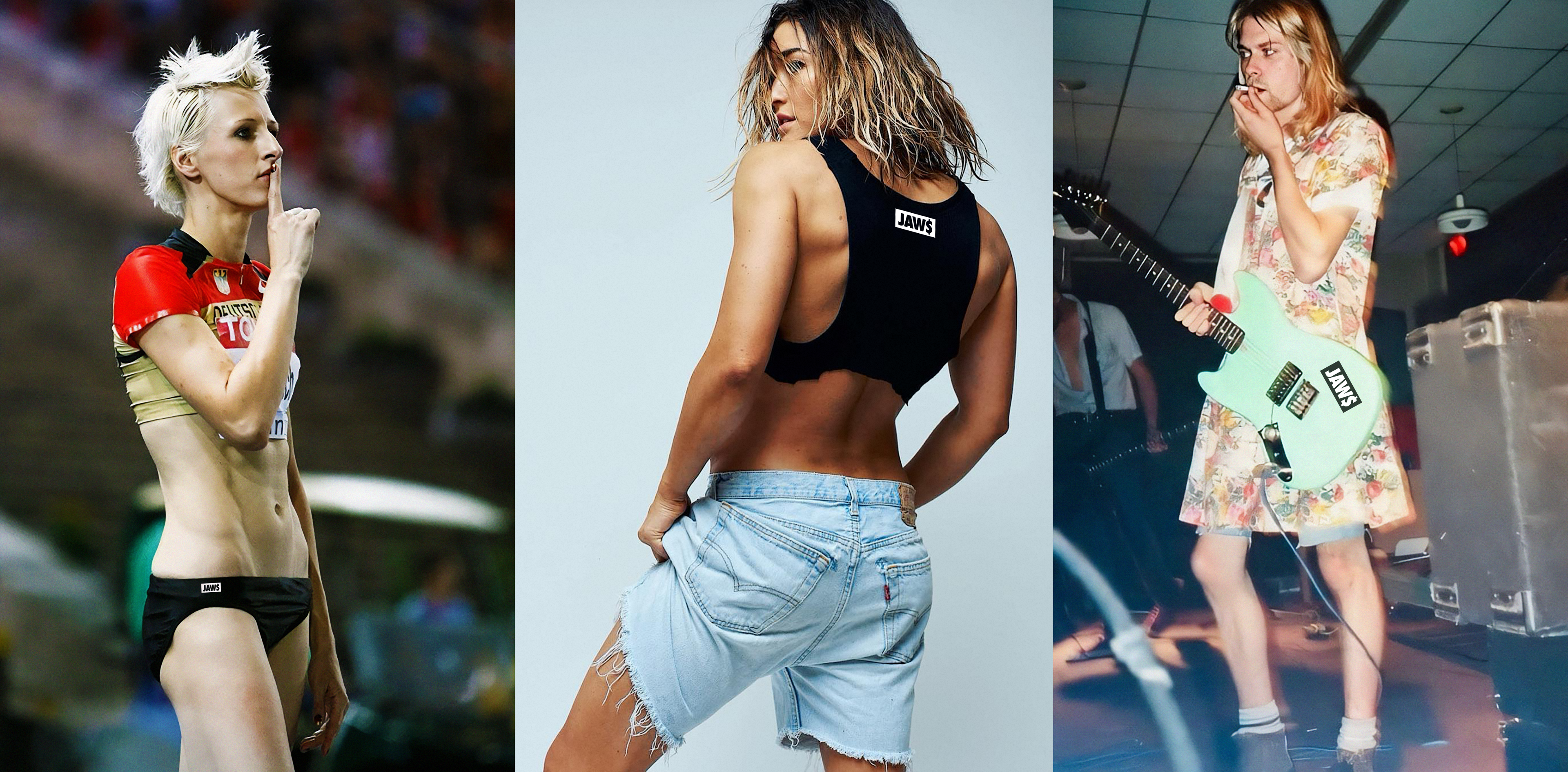
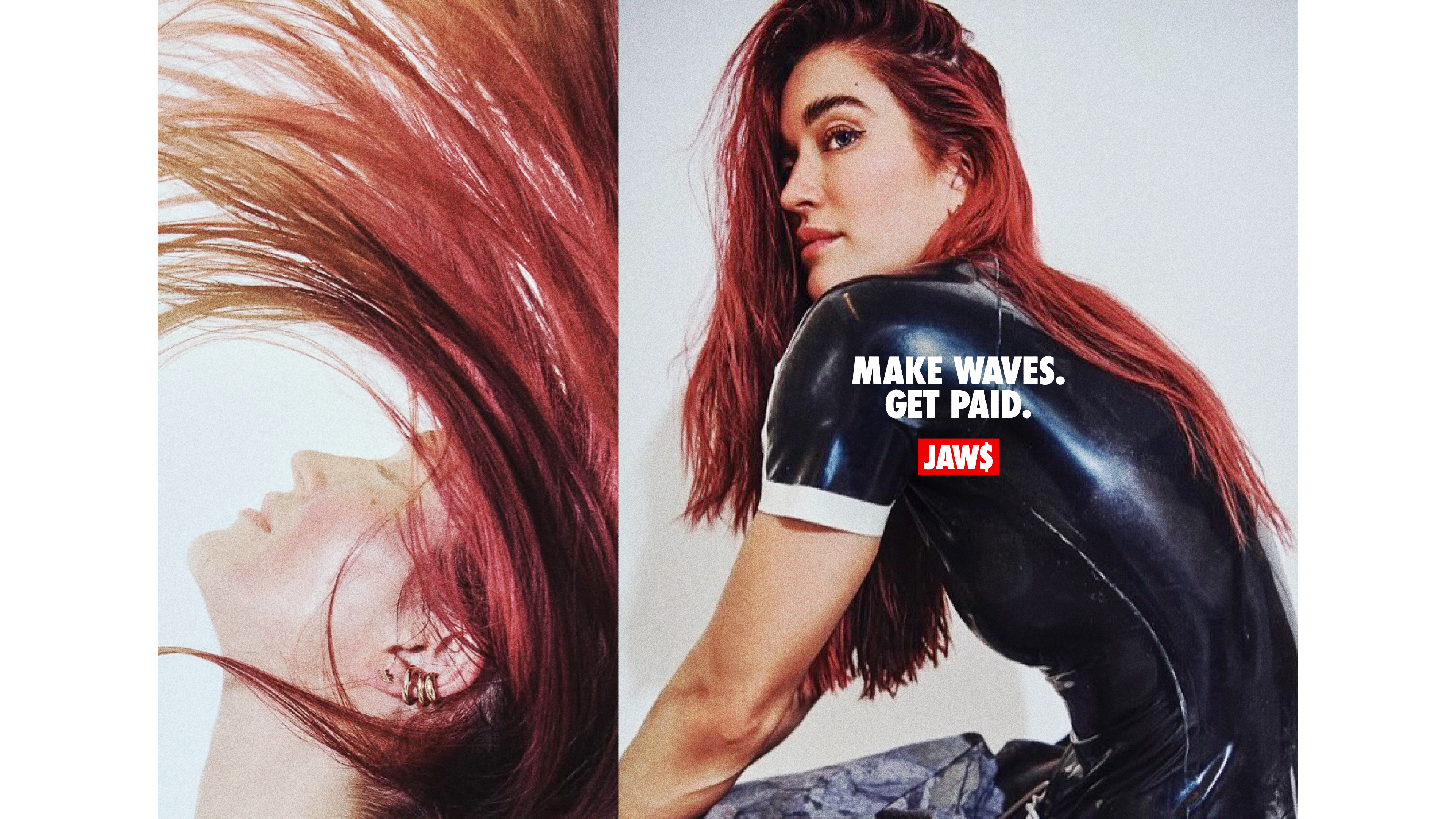
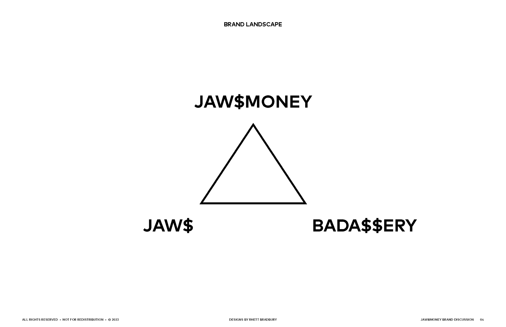
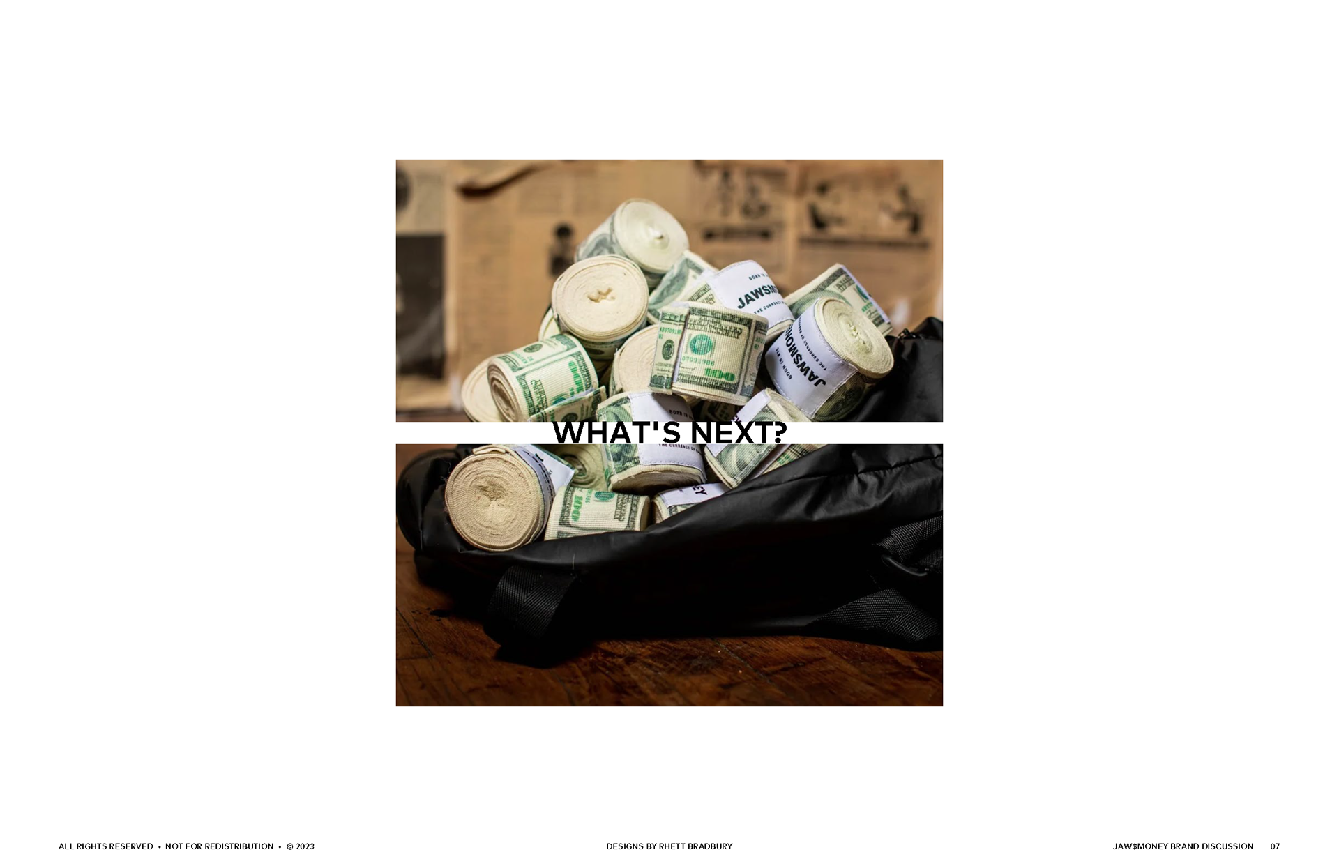
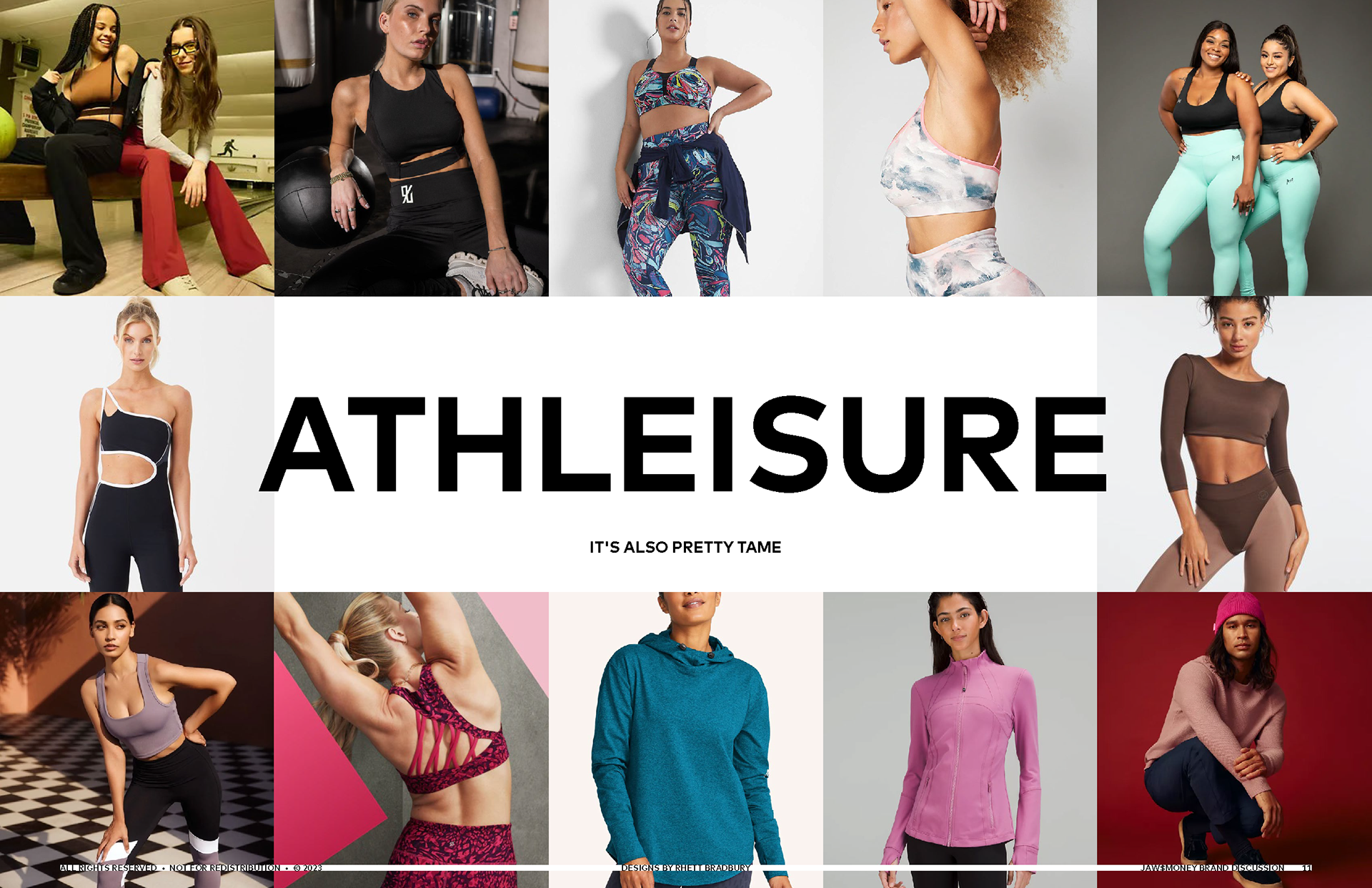
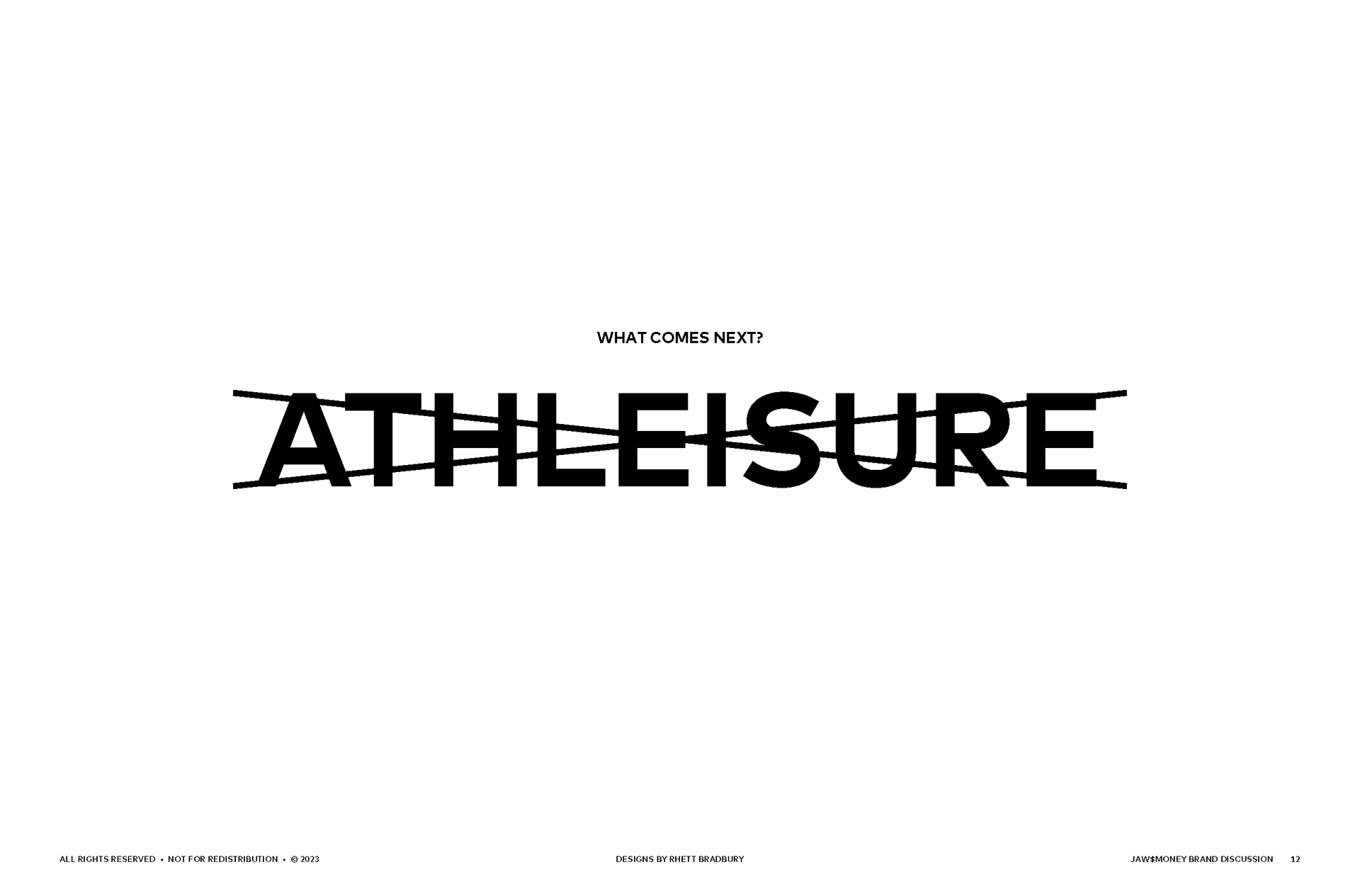
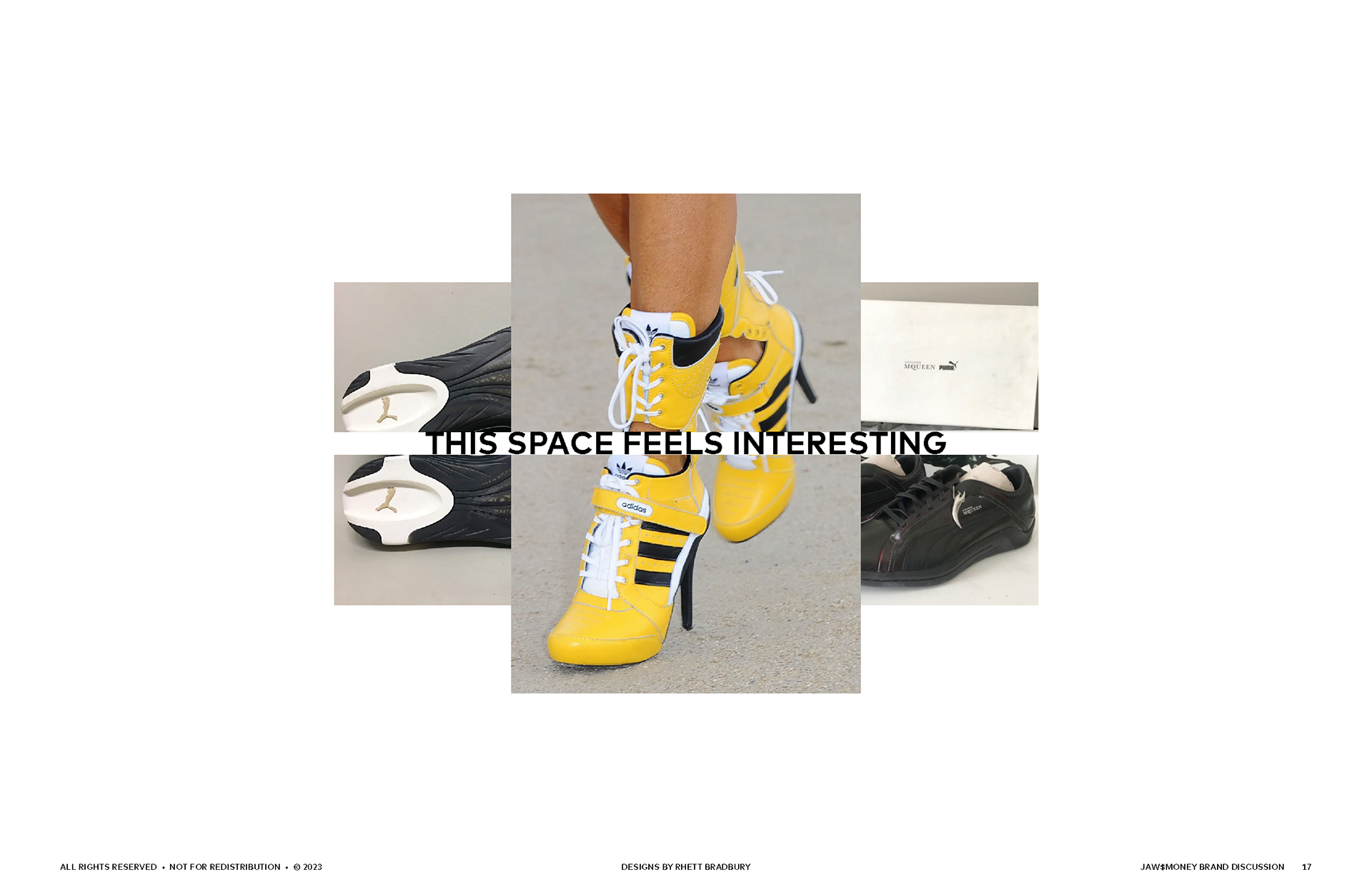
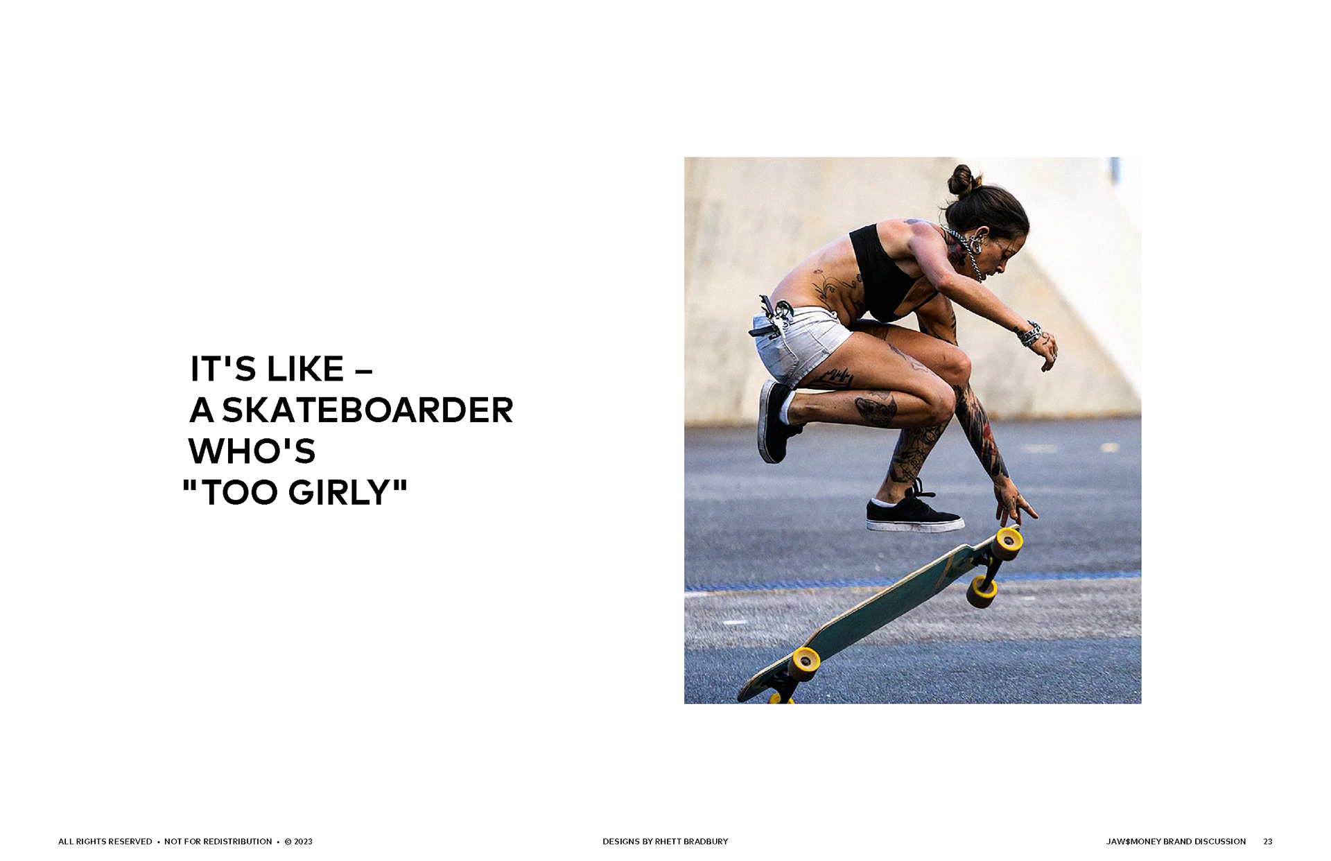
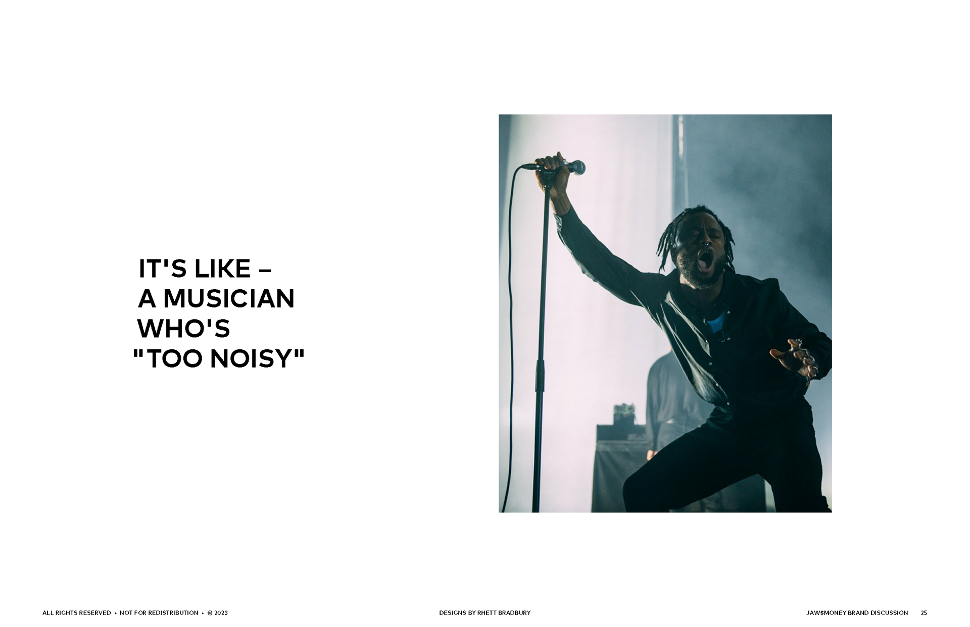
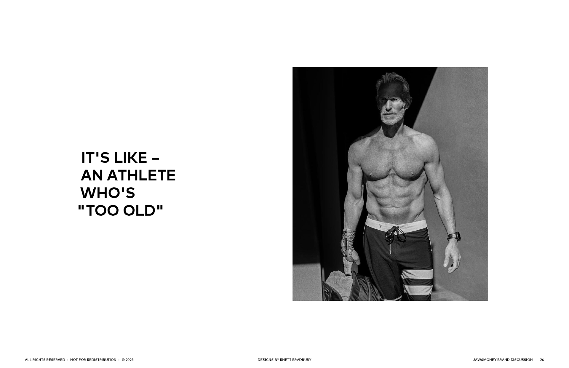
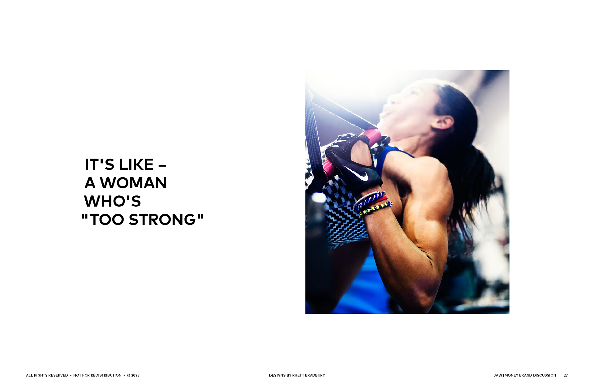
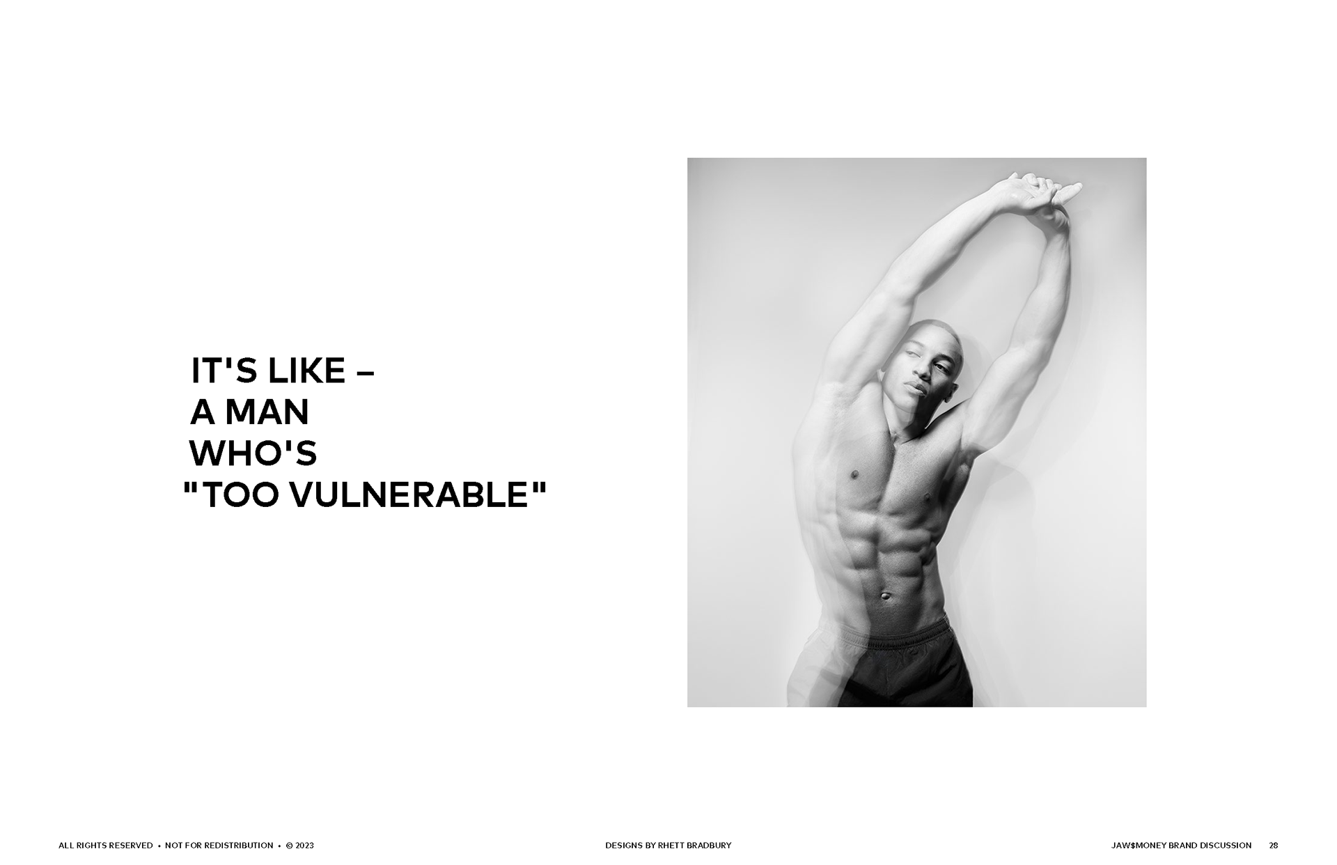
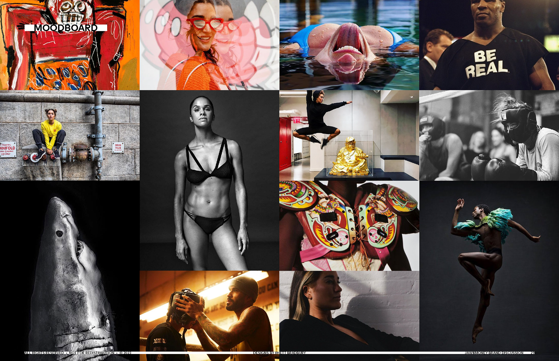
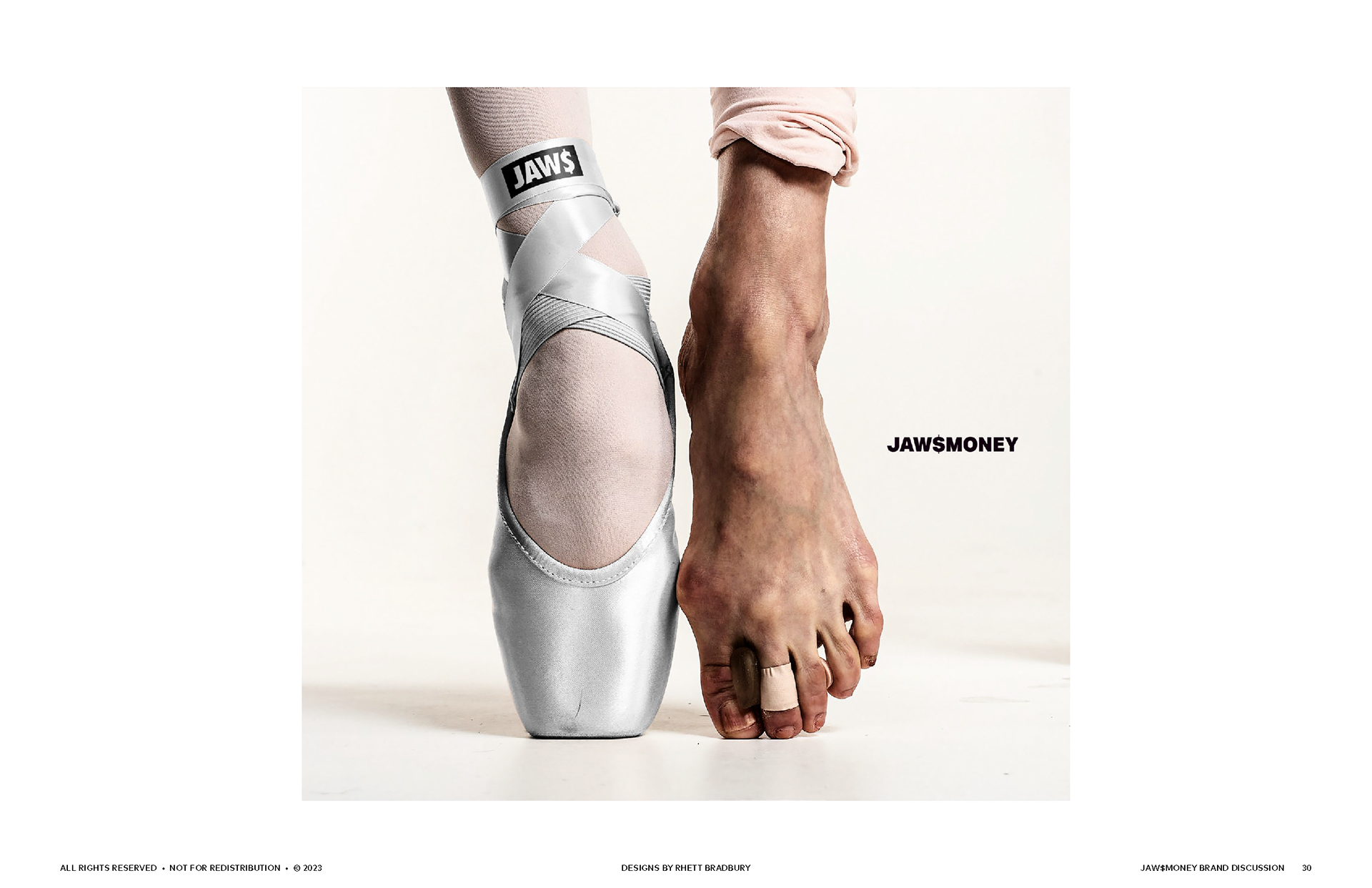
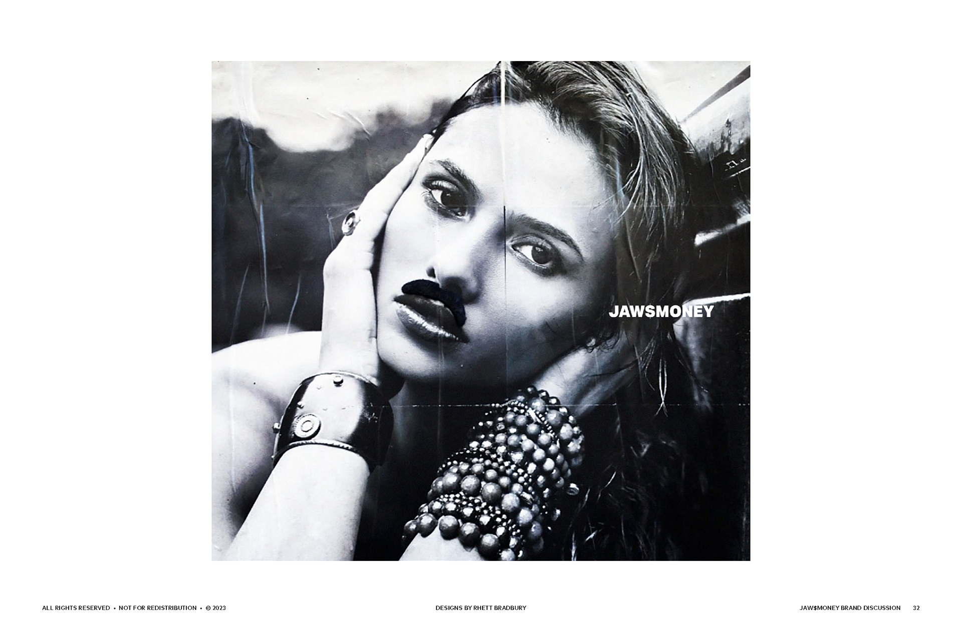
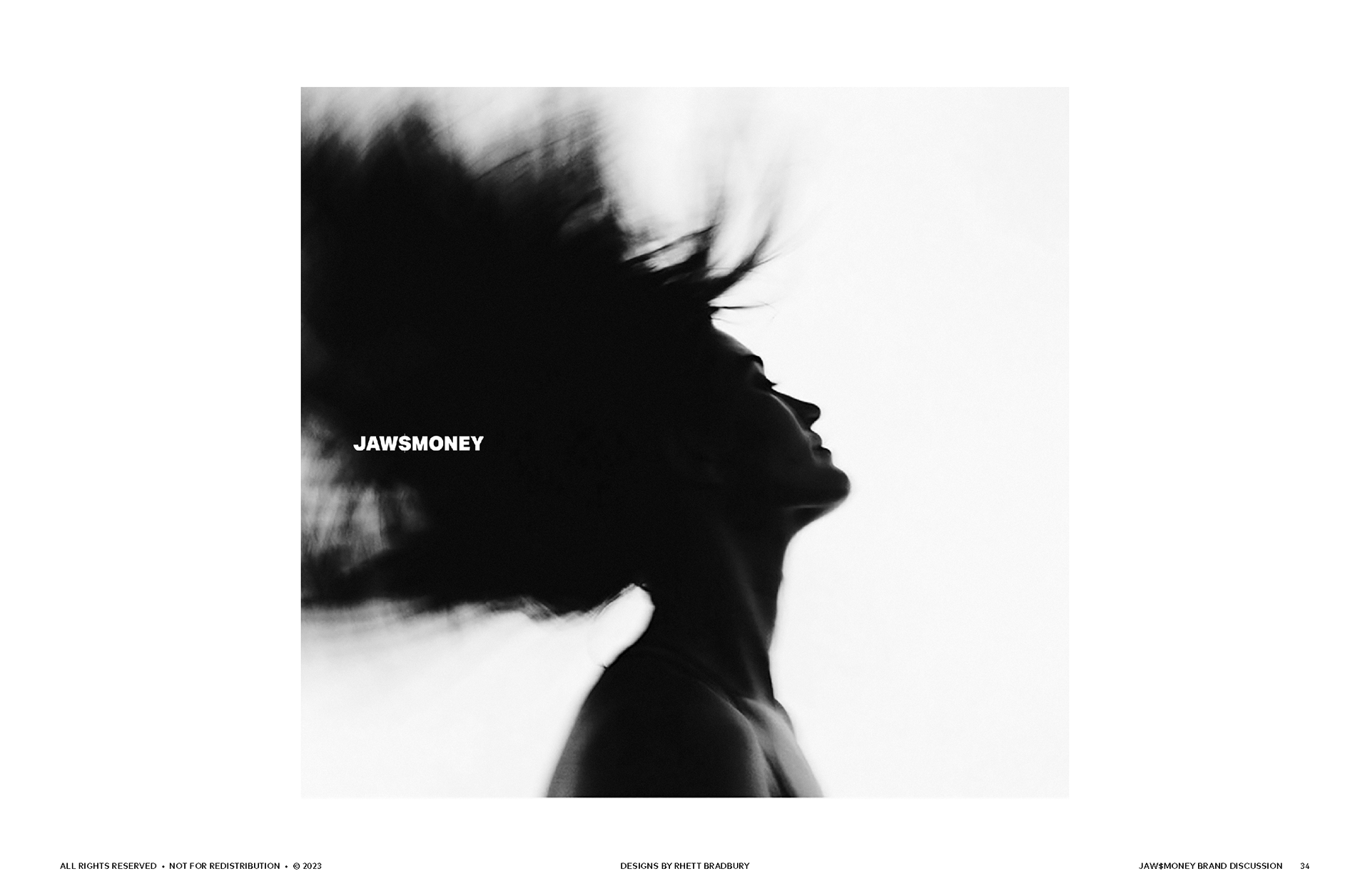
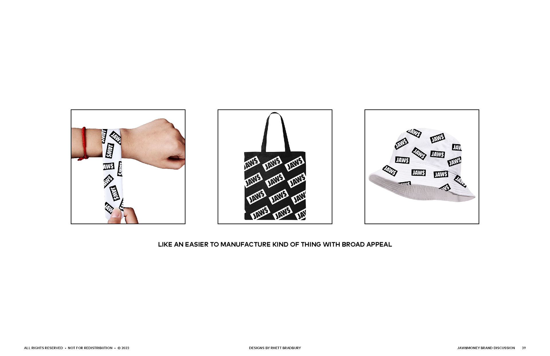
Somewhere between the boxing gym and the runway, JAW$MONEY has the potential to shake up the fitness apparel space.
Less ‘athleisure’ and more ‘fitshion’ — a brand as bold as its founder, Julie “Jaws” Nelson. I designed apparel graphics and crafted a secondary logo that leaned into the brand’s gritty-but-stylish DNA.
I even went so far as to pitch a whole new brand strategy, positioning JAW$MONEY as the Supreme of fitness — NYC attitude with high-energy design and the currency of "Bada$$ery." The direction may have evolved, but the work still packs a punch.